
Business Insights – Reporting And Analytics Dashboard With Performance Data And KPIs
Route4Me’s Business Insights dashboard is a powerful reporting tool for enterprise businesses to track field team members, vehicle fleet, and routing activities. You can customize the dashboard to filter, sort, group, and visualize real-time metrics and KPIs, helping you gather actionable last mile intelligence. Compared to the Routing Dashboard in Route4Me’s Web Software, Business Insights offers more in-depth and flexible data filters. Just sign in with your Route4Me account, and the dashboard automatically collects all necessary information. Learn more in this guide.
Table of Contents
Business Insights Overview – Open And Use Reporting And Analytics Dashboard
To open the Business Insights dashboard, go to “Business Operations” > “Business Insights” from the Navigation Menu.
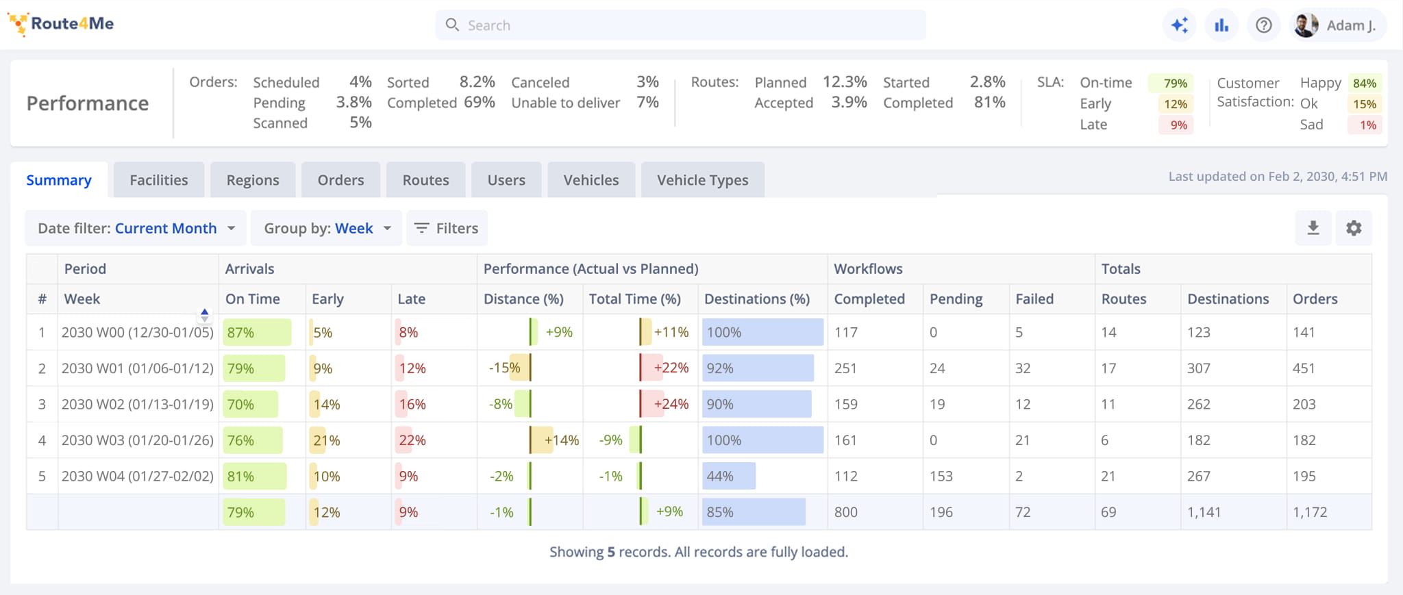
At the top of the dashboard, the Performance Summary panel displays aggregate business performance data for the selected date range. It includes performance metrics for order completion, route execution, SLAs, and customer satisfaction.
NOTE: Use the scrollbar at the bottom of the panel to view all aggregate performance metrics.
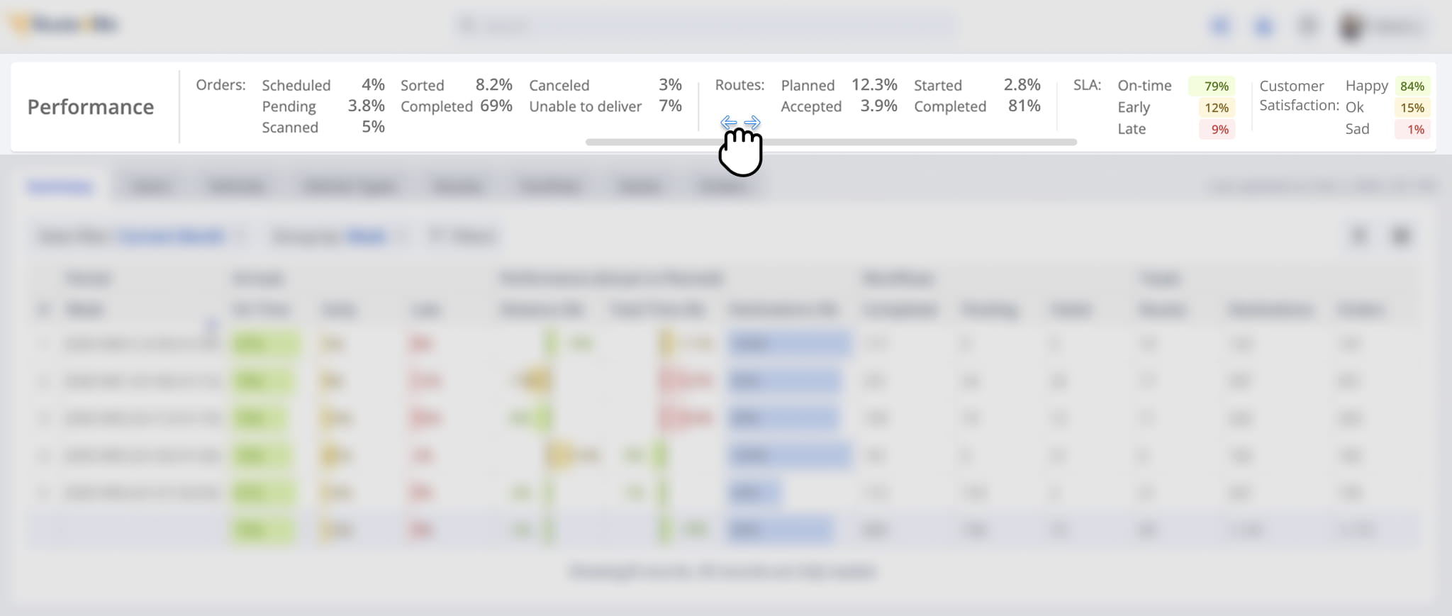
Below the Performance Summary, the main analytics data table provides detailed business performance data and lets you drill down into specific statistics. Use the horizontal scrollbar to view all available data.
To sort the table, click the Arrow Icon next to any column. Hover over the Information Icon to view a description of the associated data. The top-right corner of the table also displays the timestamp of the most recent data synchronization.
Learn more about customizing the data table later in this guide.
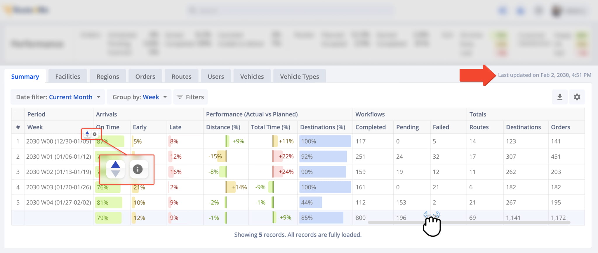
The data table uses a double header to organize related metrics into easy-to-understand groups.
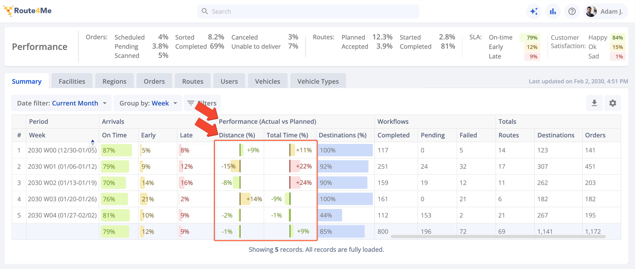
For example, the “Performance (Actual vs Planned)” section includes secondary headers for planned and completed distance, route time, and other metrics. This section also helps you identify deviations between planned and actual route performance.
The middle divider represents the planned value for each metric. A negative percentage to the left indicates that the actual value is below the planned value, while a positive percentage to the right indicates that it is above the planned value.
Deviations below 10% appear in green, deviations from 10% to 20% appear in yellow, and deviations above 20% appear in red.
Using Grouped Data Columns – Expanding Grouped Table Cells
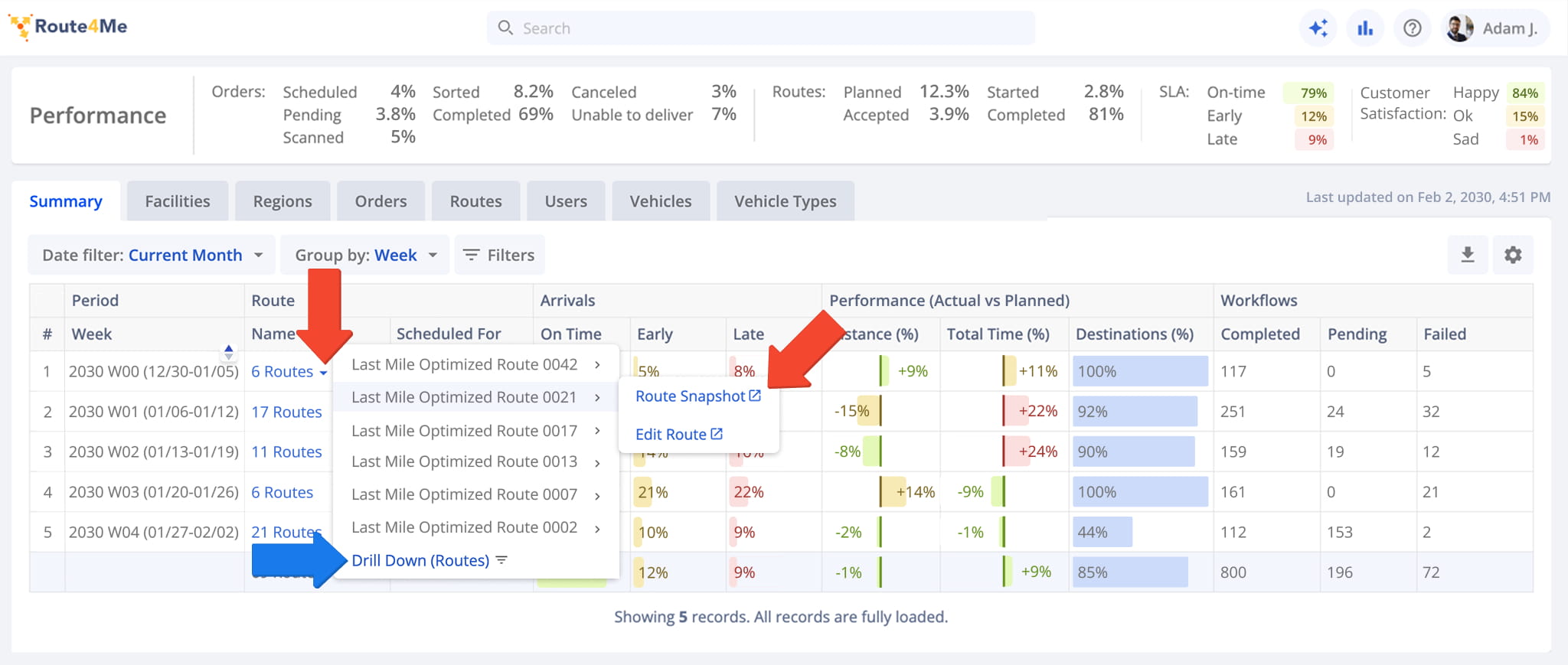
Some data table columns group multiple related entities into a single cell. You can click a grouped cell to view its individual entries, and hover over an entry to view additional details.
For example, click a “Name” cell under “Route” to view the individual routes scheduled for a specific period. Then, hover over a route to access its Route Snapshot or the Route Editor where you can make modifications.
Meanwhile, clicking “Drill Down (Routes)” opens the “Routes” tab, automatically filtered to match your selected date range.
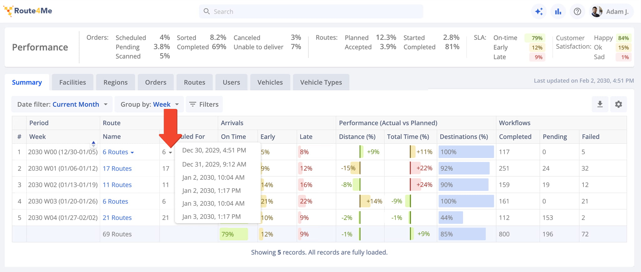
Similarly, click a cell under “Scheduled For” to view the exact dates and times routes are scheduled for during a given period.
If a group contains only one item, “Scheduled For” displays its exact date and time directly. If it contains multiple items, it displays the item count instead.
NOTE: Grouped columns appear throughout the Business Insights dashboard. Refer to the Business Insights Data Columns table further in this guide to see which columns group data this way.
AI Assistant – Submit AI Queries For Routes, Orders, And Operations
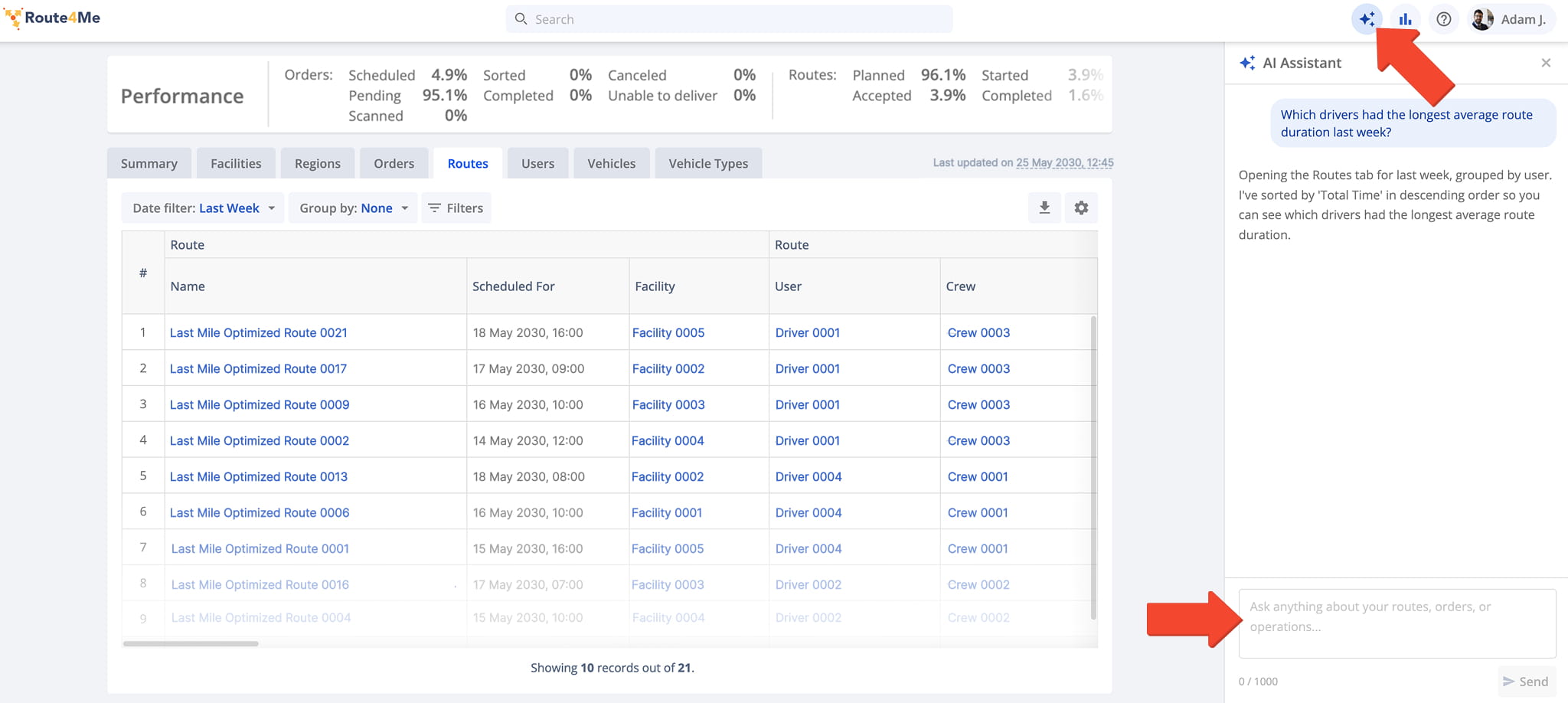
Use the AI Assistant to submit queries about routes, orders, drivers, analytics, and other operational data. Quickly find information, open reports, navigate to relevant platform areas, and receive AI-generated responses based on your request.
To open the AI Assistant panel, click the Star Icon in the top-right corner of the screen. Then, enter your request in the chat box and submit it to receive a response.
AI Insights – Generate AI Analytics And Operational Summaries
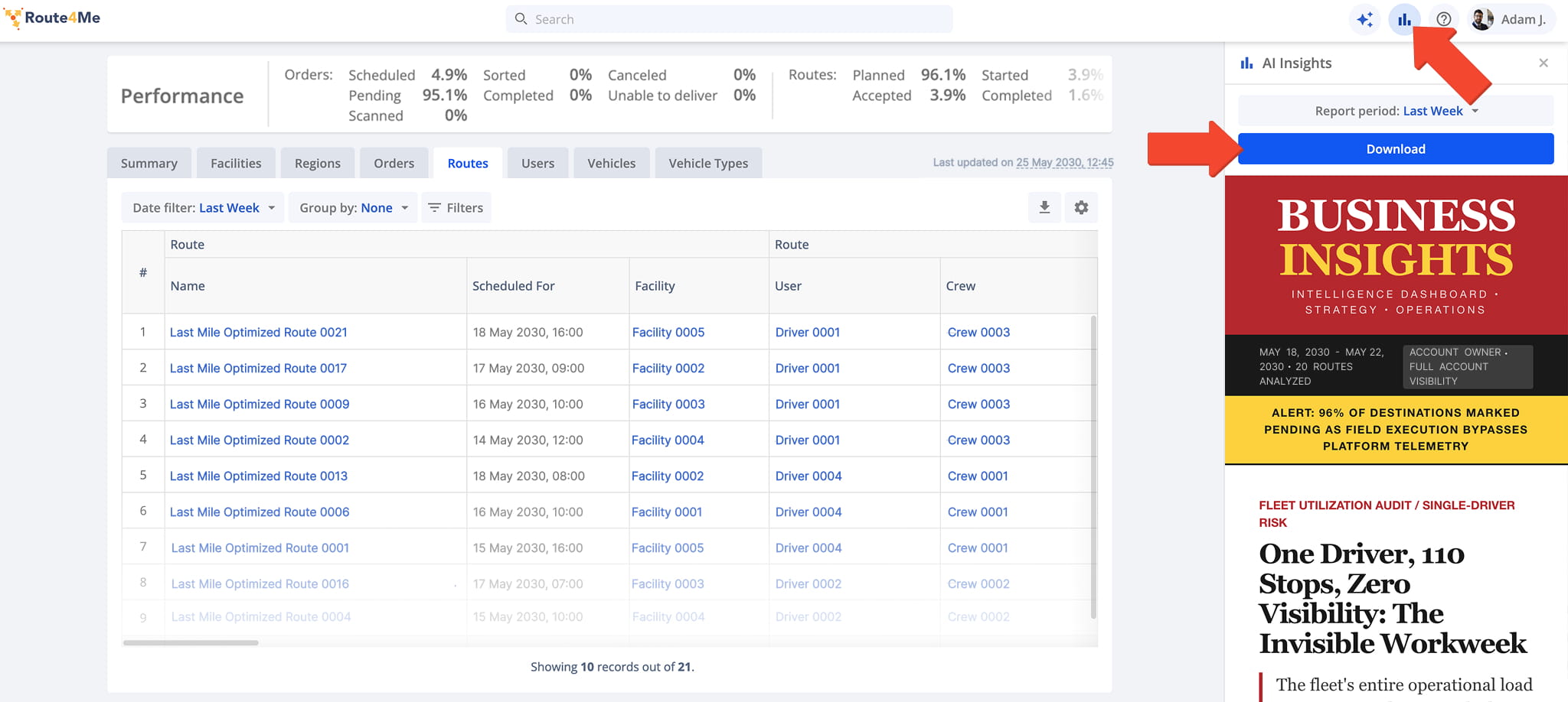
AI Insights analyzes Business Insights data to identify operational patterns, trends, anomalies, and optimization opportunities, generating a comprehensive report covering fleet performance and operational outcomes for a selected reporting period.
To access AI Insights, click the Graph Icon in the upper-right corner of the screen and select your preferred reporting period. Once the report is generated, you can review it directly in the platform or download it for sharing or offline review.
Dashboard Filters – Analytics Filter And Grouping Settings
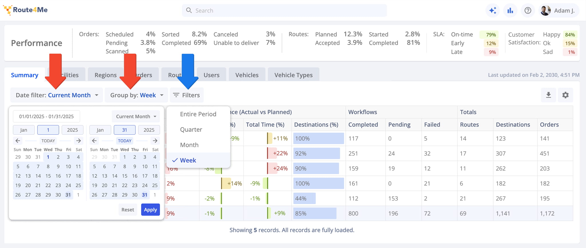
Dashboard filters are always enabled and let you narrow and group data across several dimensions, customizing what appears in the Performance Summary and analytics data table.
To set a date range, click “Date filter” and enter dates manually, select them on the calendar, or choose a predefined range. Then, click “Group by” to choose how data is organized. Use “Filters“, detailed in the table below, to further refine the data.
NOTE: A “Trailing…” date range includes data through the current date. For example, “Trailing Year” displays data from the same date one year ago through today.
Dashboard Filters
Modifying Filters – Filter Setup and Management
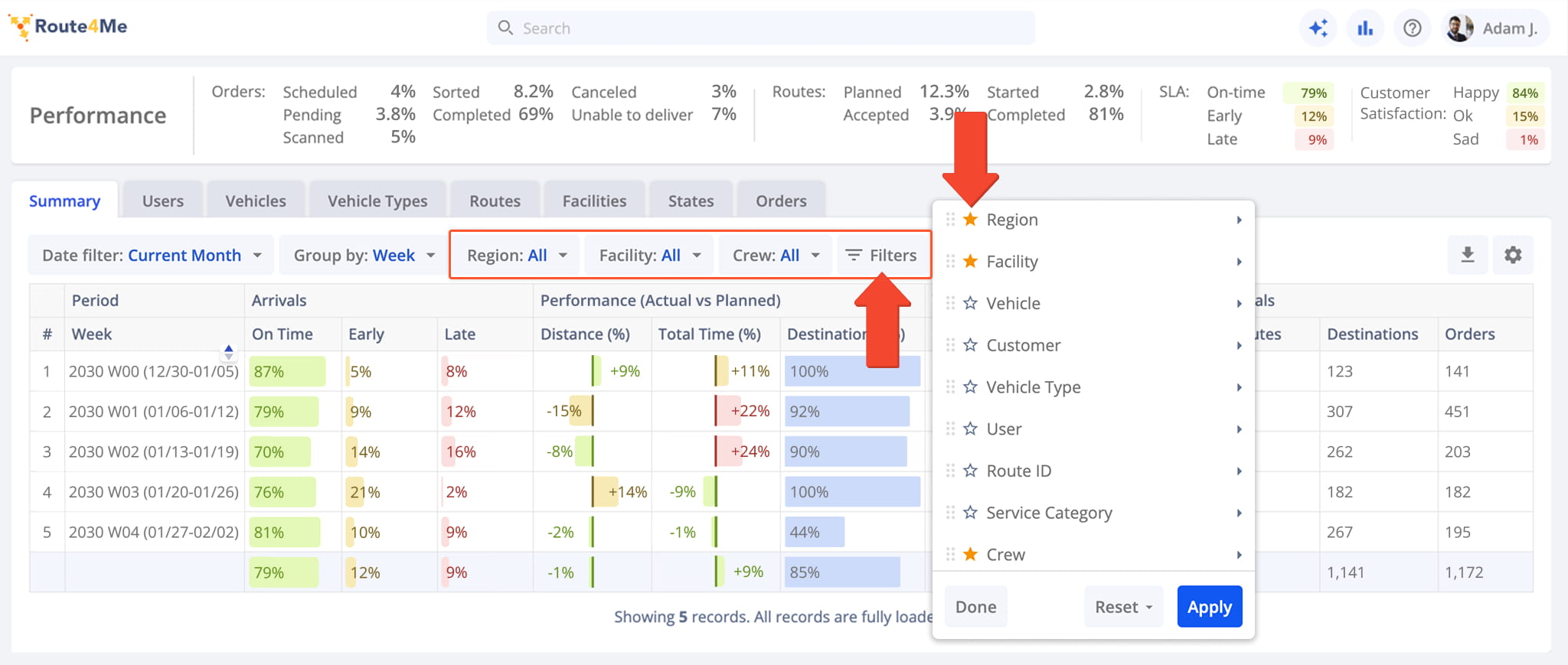
Besides “Date filter” and “Group by” which are always shown, you can add additional filters like Region, Facility, Crew, and more to suit your workflow.
There are two ways to apply these: open the “Filters” menu to select them directly, or favor filters so they appear as their own tab on the dashboard.
To favor a filter, click the star next to it. Favored filters appear as their own tab so you don’t need to reopen “Filters” each time.
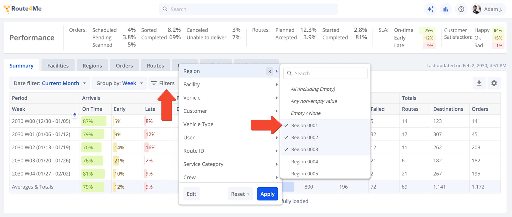
You can customize filters by opening one and selecting only the options relevant to your workflow. For example, opening the Region filter and selecting just a few regions applies only those choices, leaving the rest out.
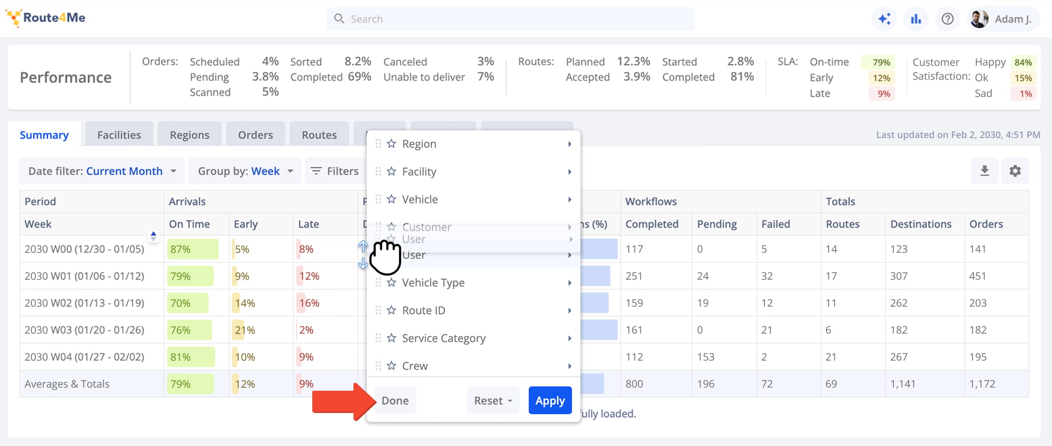
You can also rearrange filters to match how you work. Click “Edit“, then drag and drop filters into the order that works best for you. For example, you might move User to the top if you review performance by team member first.
Click “Done” to save the new order.
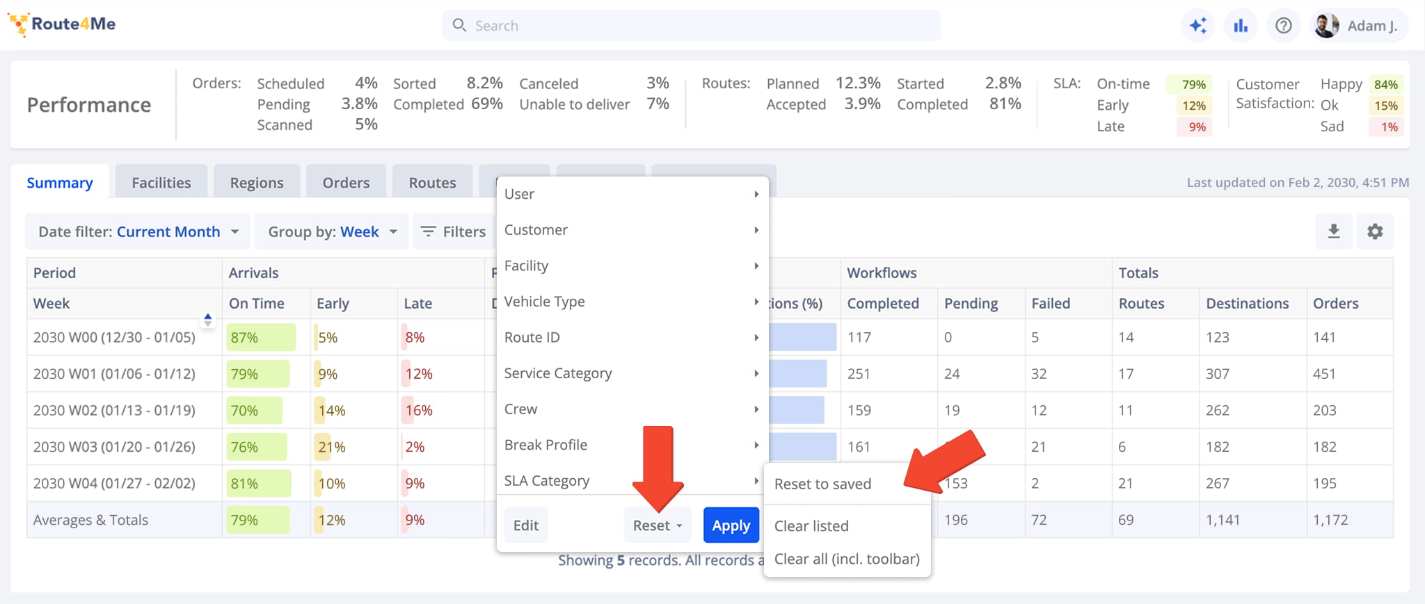
To reset your filters, click “Reset” and choose one of the following options:
- Reset to saved: Discards any unsaved changes to your filter setup and reverts to your last saved configuration.
- Clear listed: Clears filters selected in the “Filters” menu, leaving favored (toolbar) filters untouched.
- Clear all (incl. toolbar): Clears every filter, including favored ones.
Analytics Categories – Dashboard Data Table Tabs And Sections
The Business Insights dashboard organizes performance data into tabs based on different areas of your last mile business. You can view KPIs for your organization, last mile routing team, transportation fleet, routes, facilities, orders, and more.
See the table below for more information about each Business Insights category.
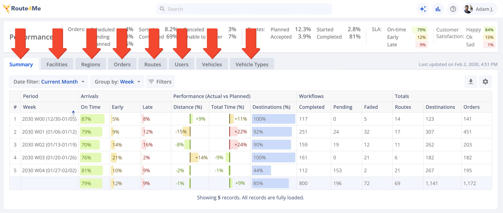
Business Insights Categories
Configure Data Table – Custom Analytics Display Columns And Dashboard Settings
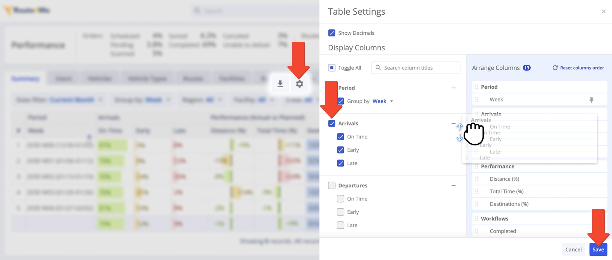
Customize the analytics data table to display only the data relevant to your business needs. Click the Table Settings (Gear) Icon, then select the checkboxes for the columns you want to display. You can also drag and drop column names to reorder them.
When you’re finished, click Save to apply your changes. To restore the default column order, click “Reset columns order“. See the table below for more information about available Business Insights data columns.
Business Insights Data Columns
Available Data Columns – Variance By Dashboard Category
Available data columns vary by dashboard category. See the table below to find which top-level headers are available in each data table tab.
Column Availability By Category
Export Analytics – Download Business Performance Data Spreadsheet
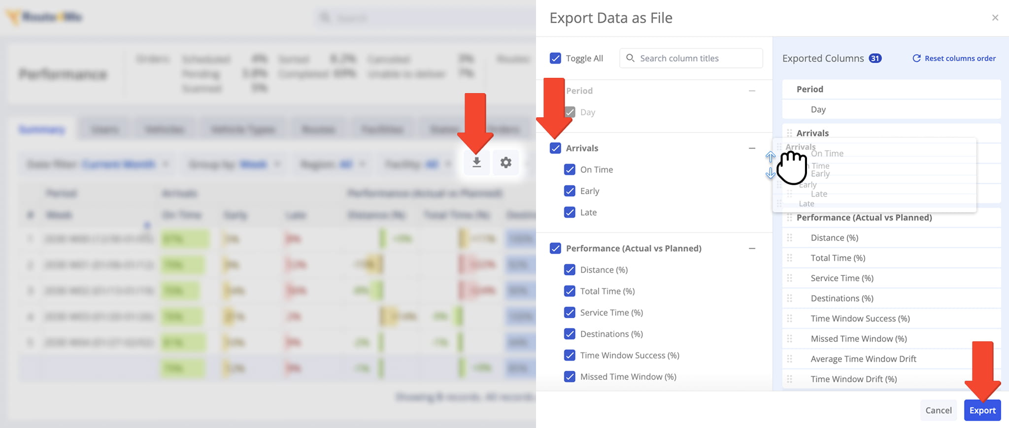
After filtering and customizing the dashboard, you can export your performance analytics to a spreadsheet. Click the Download button to open the “Export Data as File” panel.
Select the KPI data columns you want to include by checking the corresponding boxes. You can also drag and drop column names to reorder them. When you’re finished, click “Export” to download your customized analytics file.
Visit Route4Me's Marketplace to Check out Associated Modules:
- Operations
Audit Logging and Activity Stream
- Operations
Custom Data Add-On
- Operations
Advanced Team Management Add-On
About author: Kristian Andreev