
Planned VS Actual Route Reporting And Analytics – Classic Charts Dashboard
Route4Me’s classic Charts Dashboard is a powerful route analytics and reporting tool that centralizes real-time last mile intelligence. Use it to compare scheduled destinations with visited addresses, monitor drivers in real time, and track key performance indicators and deviations. It also syncs data between Route4Me’s iOS and Android mobile apps and Route4Me’s trusted route planner software, keeping office and field teams aligned. With flexible filtering, sorting, and grouping settings, you can customize your Dashboard to meet your unique routing and smart logistics needs.
NOTE: The classic Charts Dashboard is deprecated and may not be available on your account. For the same analytics and reporting tools, plus more advanced performance metrics and data filters, use Business Insights.
Table of Contents
Scheduled Routes – Classic Charts Dashboard View And Filter Options
To open your enterprise route management software Dashboard, click the button below.
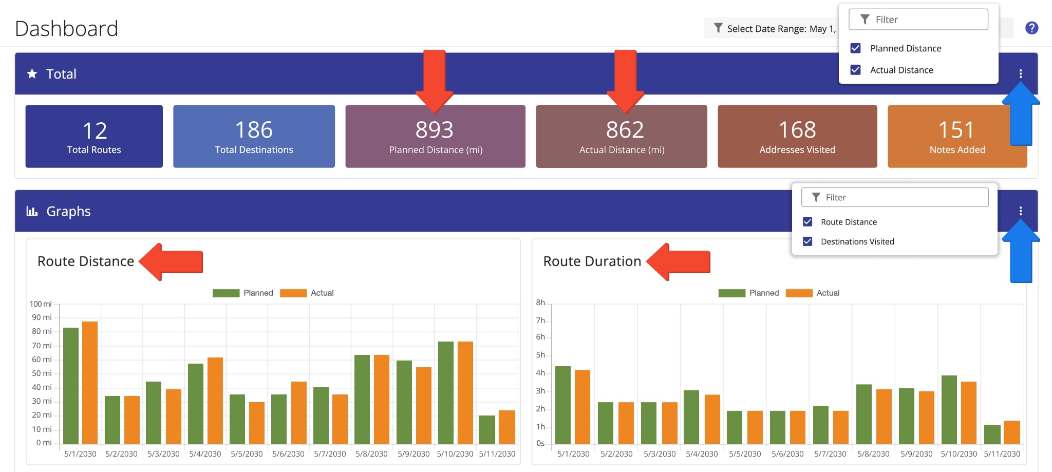
The “Total” section provides a customizable, high-level summary of your organization’s or team members’ real-time and historical route performance based on your selected filters, detailed in the table below.
Use the “Select Date Range” field to filter the classic Dashboard by time frame and user, or group data by date and destination type.
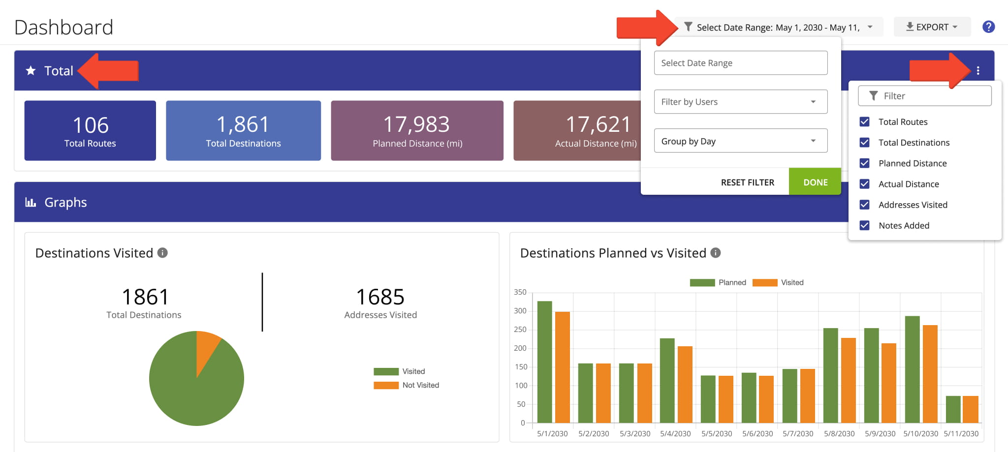
Route Performance Filters
The “Graphs” section provides a visual comparison of planned and actual route data for your selected date range.
Planned values come from Route4Me’s route planning software when routes are planned and optimized, while actual values are reported by field team members or automatically captured through tools such as geofencing and telematics integrations.
Use the Three-dot Icon to select the data items you want to display, detailed in the table below. This lets you focus the classic Dashboard on the route metrics that matter most to your operation.
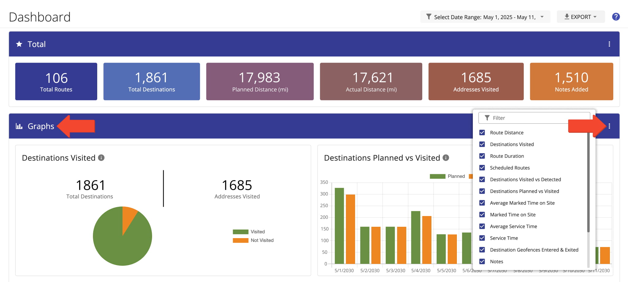
"Graphs" Data Items
After applying your preferred filters, you can export the displayed route data from the Dashboard. Click “Export” and select your preferred export option from the menu, detailed below.
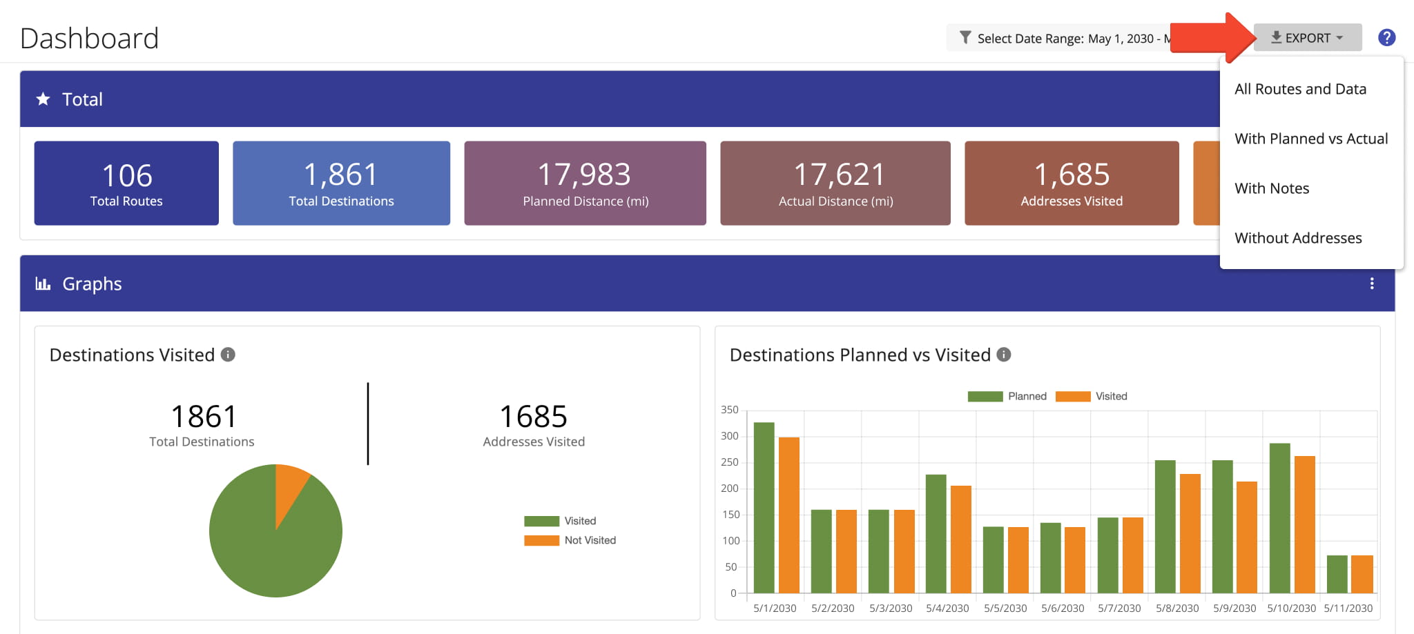
Export Options
Route Distance And Duration – Classic Dashboard Analytics
Route4Me’s classic Charts Dashboard lets you compare planned and actual route distance and duration to evaluate driver performance and monitor route progress.
For a quick overview, enable the relevant metrics in the “Total” section. For a more detailed comparison, open the Three-dot Icon menu in the “Graphs” section and enable “Route Distance” and “Route Duration“.
The “Graphs” section then displays the planned and actual values for your selected routes and date range.
Planned VS Actual Route Distance
The “Route Distance” graph compares the planned and actual distance of routes scheduled for your selected date range and team members.
For route-level details, view the Routes List. The “Planned Distance” column shows the planned distance for each route, while “Actual Travel Distance (Mobile App)” shows the distance actually driven, walked, or cycled, as detected by the Route4Me Mobile Apps.
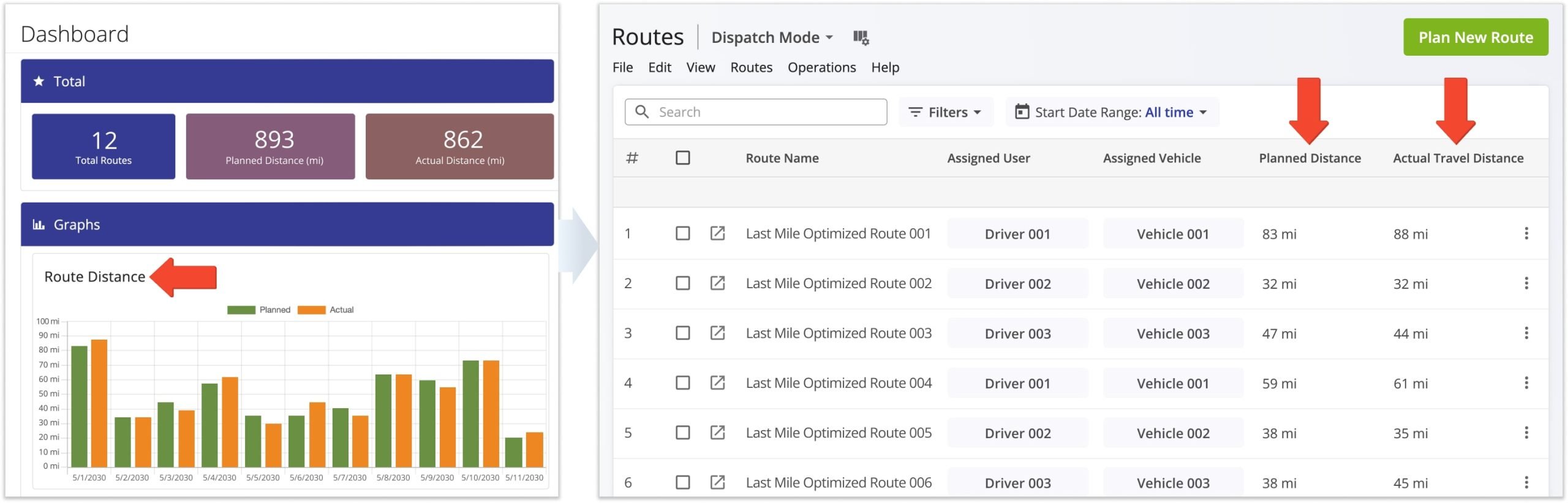
“Planned” distance is the estimated distance calculated for an optimized route, while “Actual” distance is the distance traveled by the assigned driver or field employee.
Route4Me captures actual travel data through GPS tracking, mobile apps, and telematics integrations and brings it together in the classic Charts Dashboard for easy comparison and analysis.
NOTE: Learn more about Route4Me’s Telematics and GPS tracking.
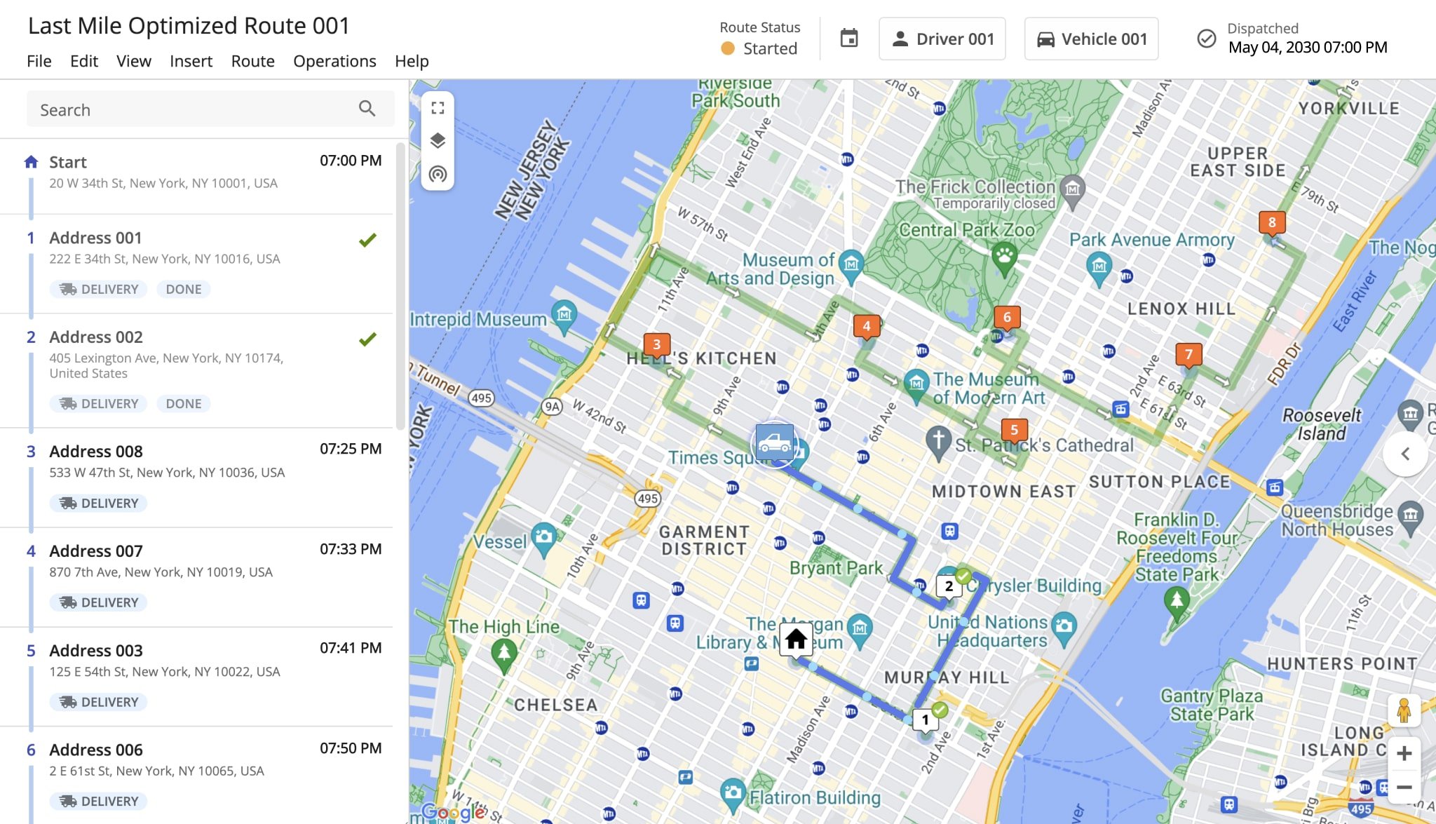
Planned VS Actual Route Duration
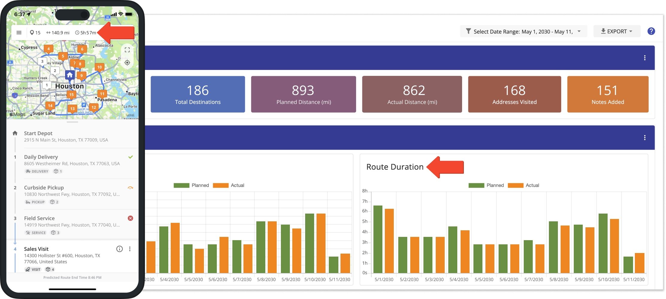
The “Route Duration” graph compares the planned and actual duration of routes scheduled for your selected date range and team members.
For route-level details, view the Routes List. The “Planned Duration” column shows the estimated time for each route, while “Actual Travel Time (Mobile App)” shows the time actually spent traveling, as detected by the Route4Me Mobile Apps.
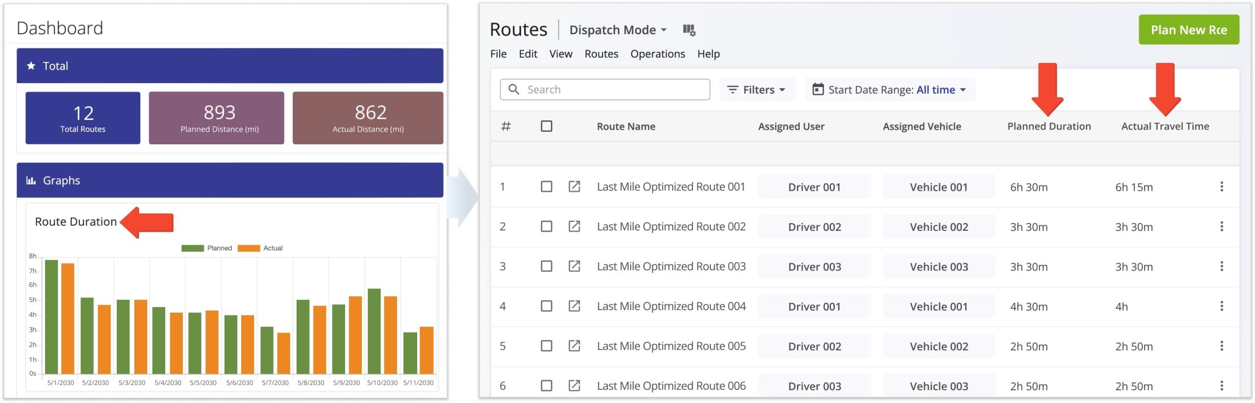
The “Route Duration” value in the Charts Dashboard includes both travel time and service time. In the Routes List, “Actual Travel Time” shows the time the assigned driver actually spent traveling while completing the route.
This distinction helps you compare planned route duration with actual time spent on the road.
Destination Tracking With Classic Charts Dashboard – Planned Vs. Actually Visited
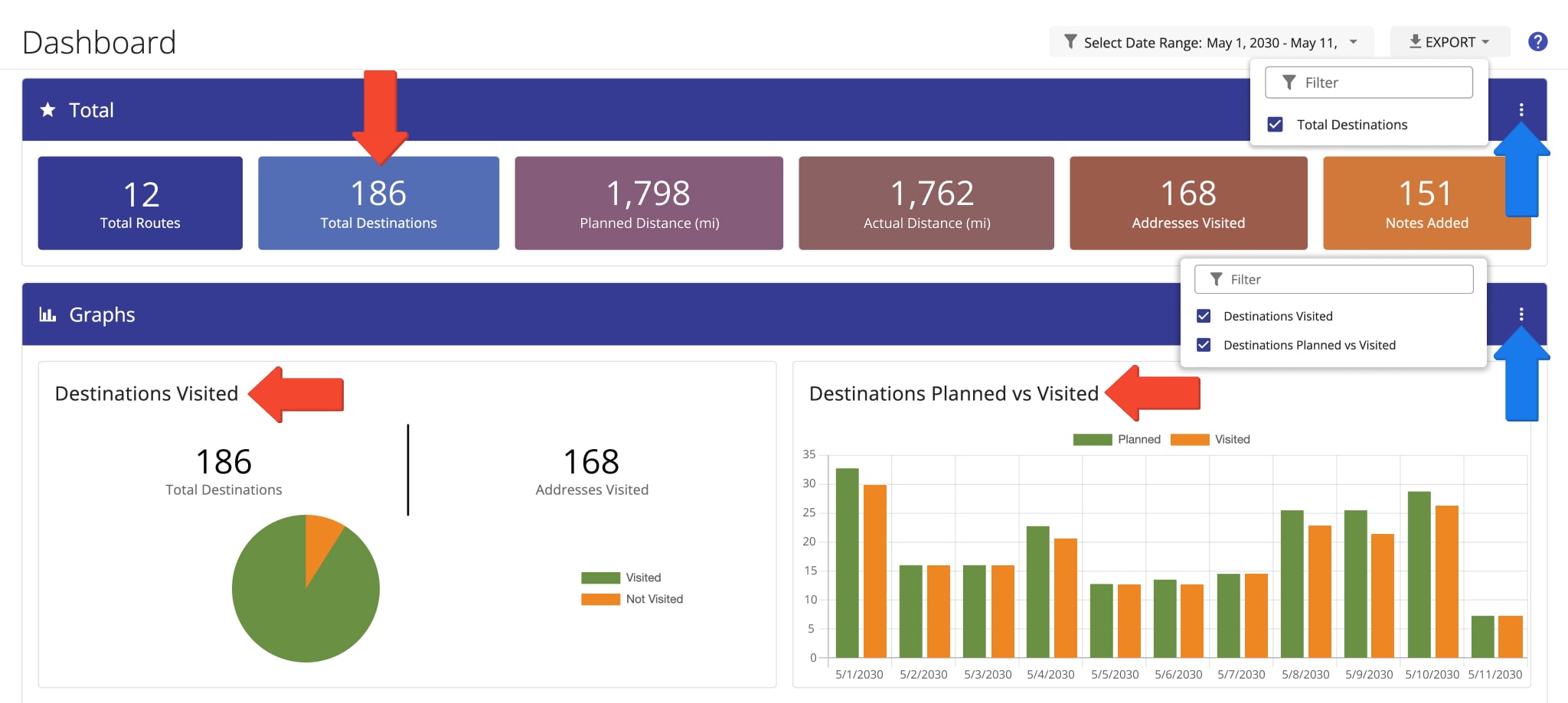
The Classic Charts Dashboard lets you compare the number of destinations planned for a route with the number actually visited. Use this data to monitor route progress and evaluate driver performance.
For a quick overview, enable “Total Destinations” in the “Total” section. For a more detailed comparison, open the Three-dot Icon menu in the “Graphs” section and enable “Destinations Visited” and “Destinations Planned vs Visited“.
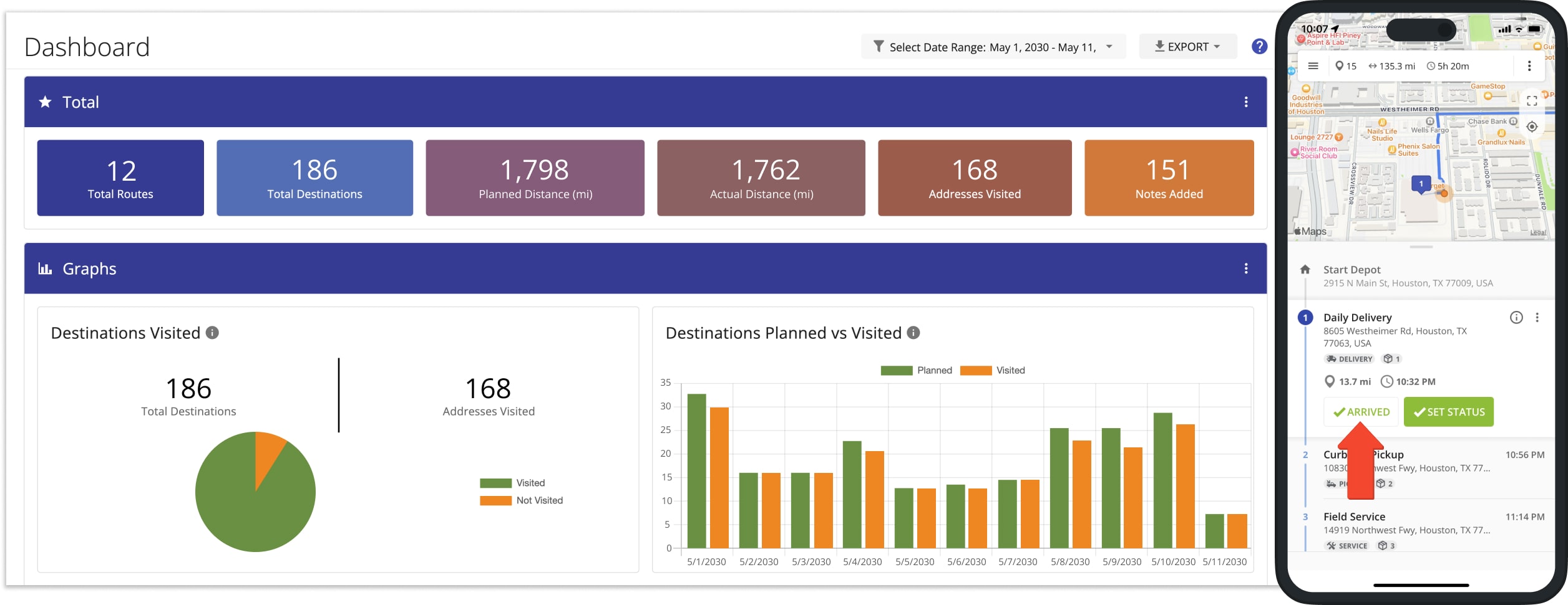
A destination is considered visited when the assigned team member marks it “Arrived“.
Dispatchers and managers can plan and dispatch routes from the office, while drivers update destination statuses in the field.
These updates sync in real time, allowing you to track route progress and compare planned destinations with those actually visited in Route4Me’s classic Charts Dashboard.
The “Destinations Visited” graph compares the number of planned destinations with those marked as visited for your selected dates and team members.
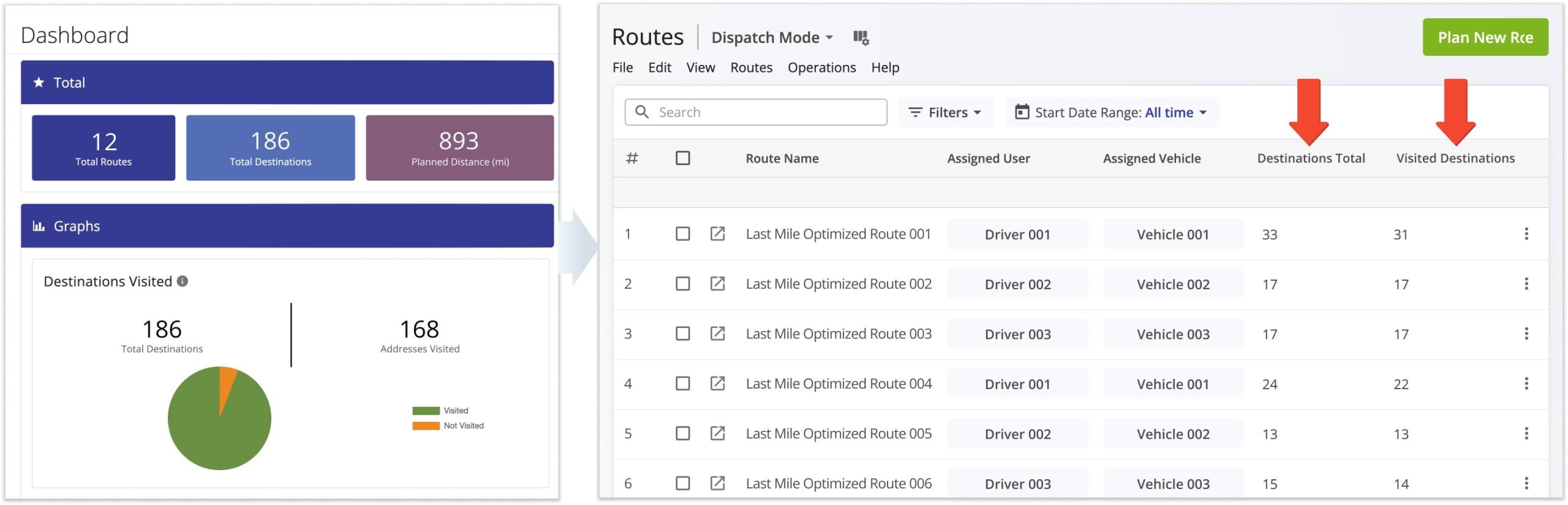
For route-level details, use the Routes List to compare the “Destinations Total” and “Visited Destinations” columns for individual or all routes.
Visited Vs. Detected Destinations – Manual And Geofence Tracking
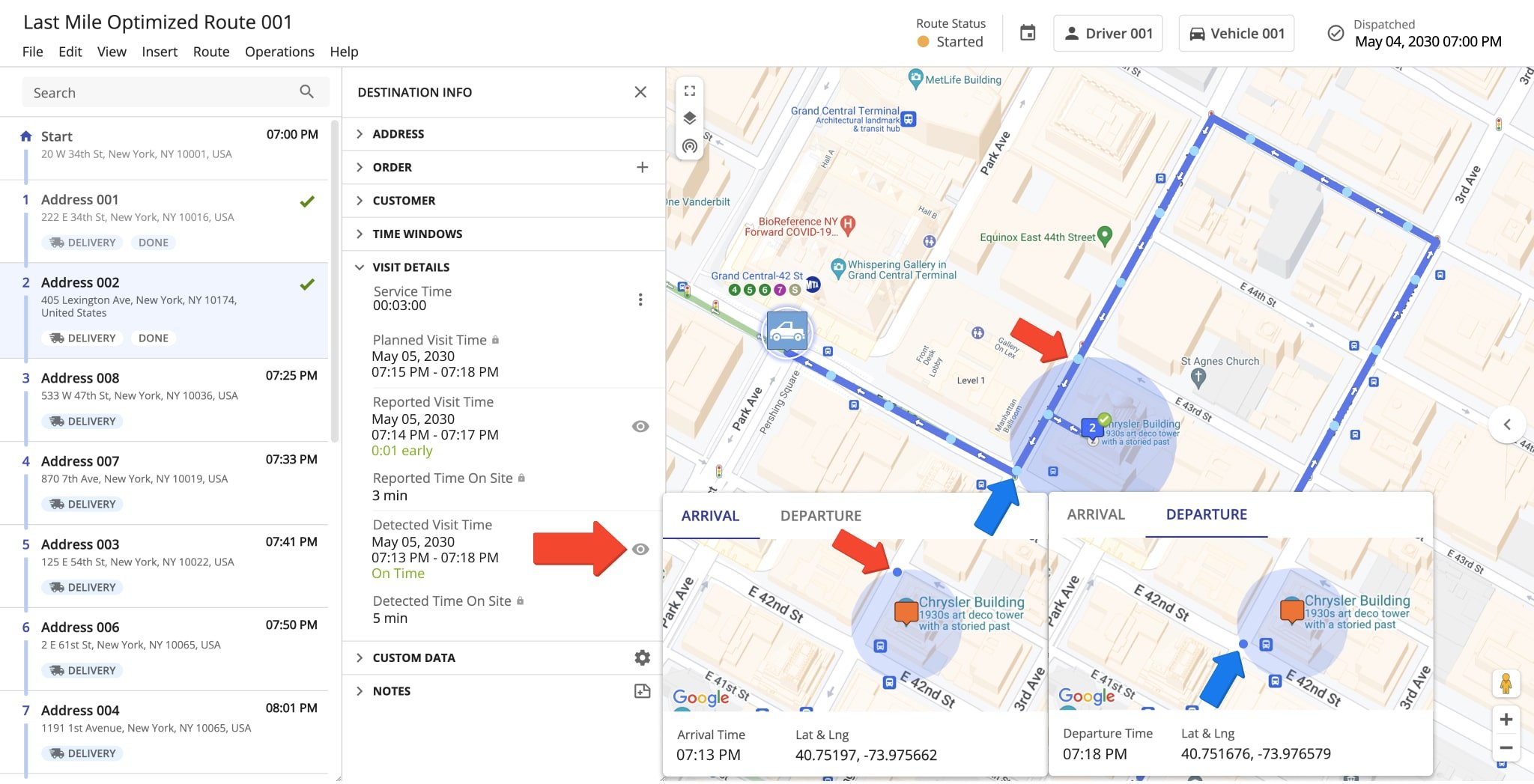
Route4Me can track visited destinations in two ways: team members can manually mark a destination as visited, or Geofencing can automatically detect when a vehicle enters and exits a defined geofence.
Use the classic Charts Dashboard to compare manually marked and automatically detected visits.
In the “Graphs” section, enable “Destinations Visited vs Detected” to compare the two metrics, or enable “Destination Geofences Entered & Exited” to see addresses detected as entered or departed through geofencing.
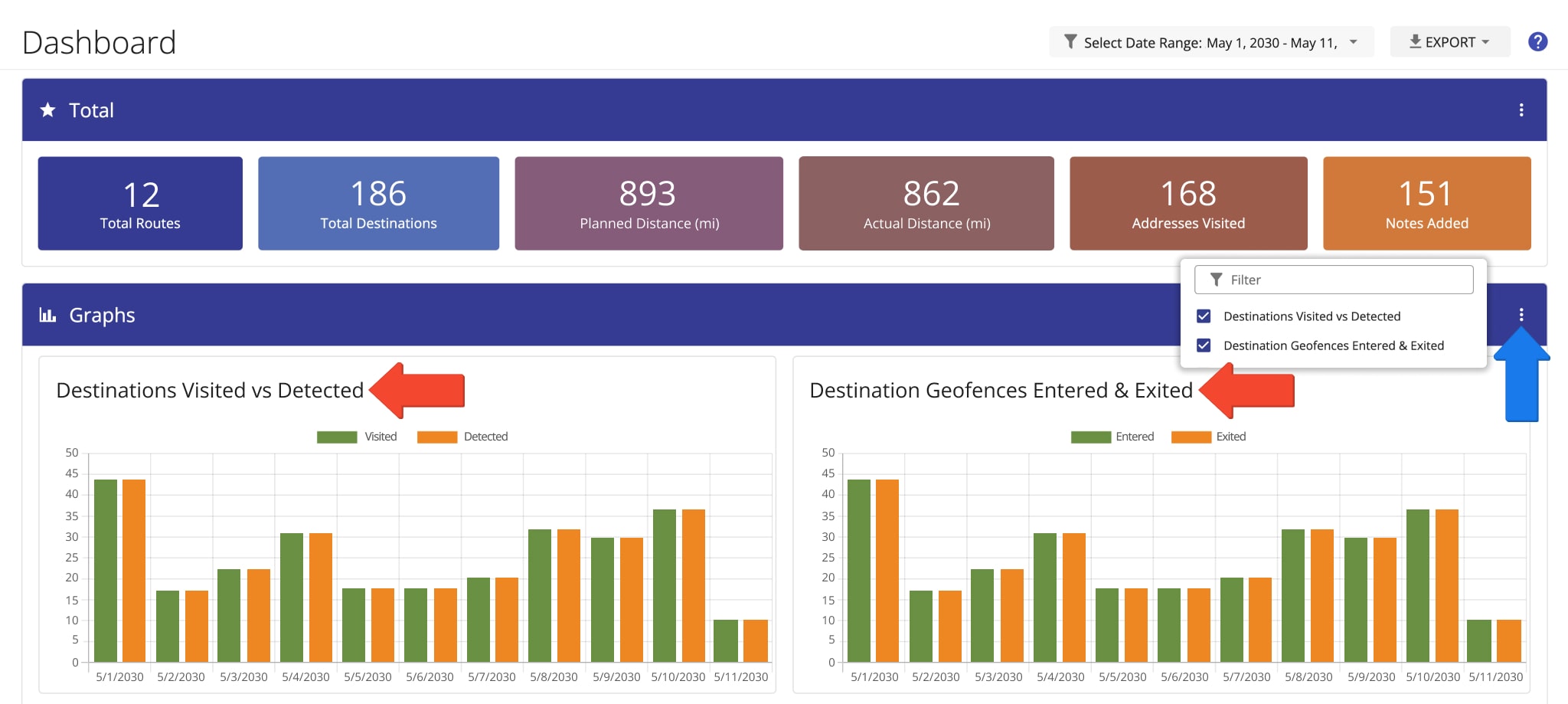
A destination is automatically detected as “Arrived” when a vehicle enters its geofence without exceeding the maximum speed defined in your geofence settings.
It is detected as “Departed” when the vehicle exits the geofence after meeting the configured “Time on Site“. NOTE: Learn more about Time on Site and geofence-detected arrival and departure.
Time On Site – Marked And Average Time Spent On Site
The classic Charts Dashboard lets you compare the total and average time drivers spend at destinations.
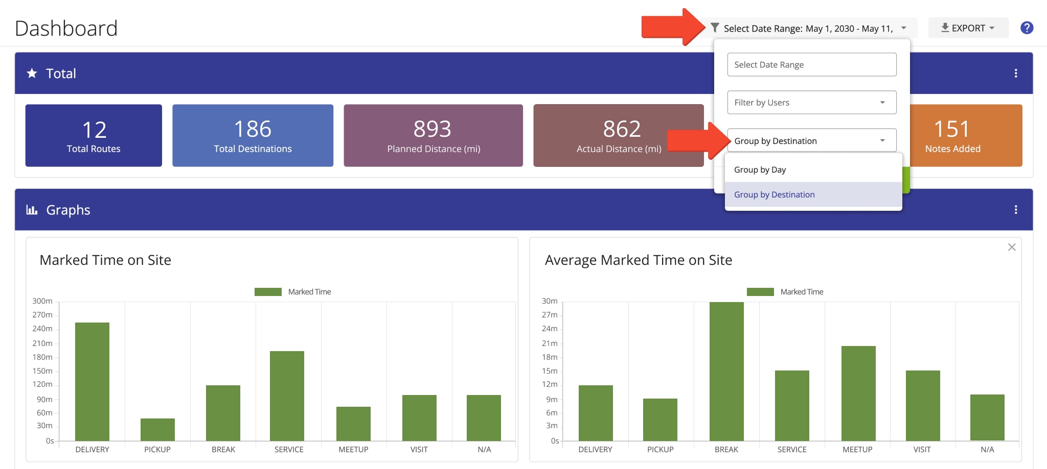
In the “Graphs” section, open the Three-dot Icon menu and enable “Marked Time on Site” and “Average Marked Time on Site” to view these metrics for your selected dates and team members.
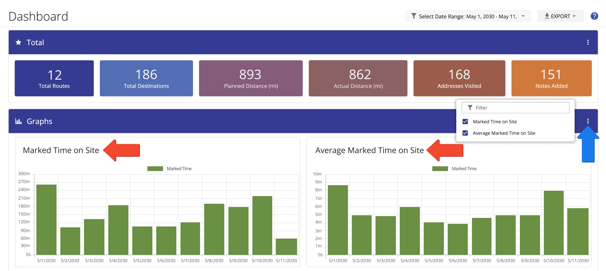
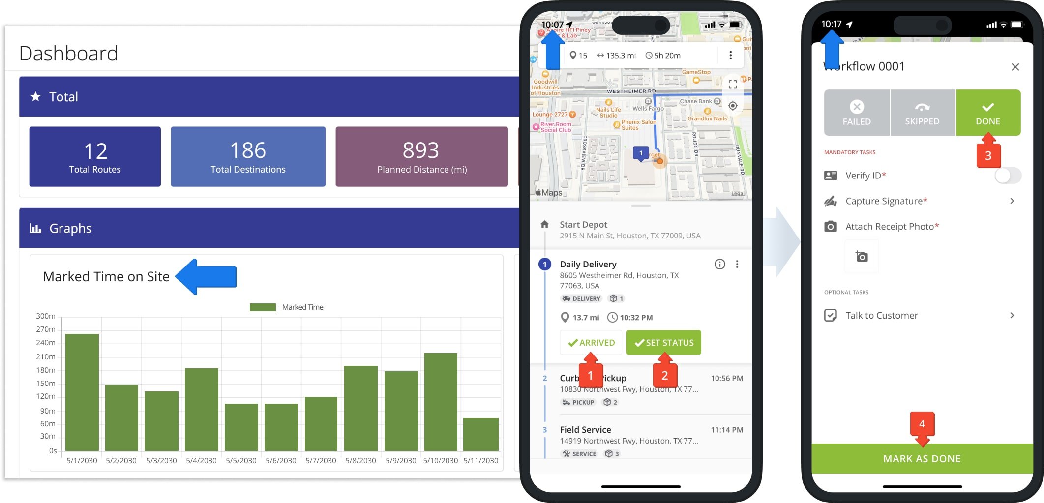
“Marked Time on Site” is the time between when a team member marks a destination “Arrived” and when they mark it “Done” or “Failed“.
The “Marked Time on Site” graph shows the total manually recorded time spent at destinations across routes scheduled for your selected date range and team members.
The “Average Marked Time on Site” graph shows the average time team members spend at destinations on routes scheduled for your selected date and users.
You can also change how this data is grouped on the classic Charts Dashboard. Select “Group by Day” to view time-on-site data by date, or “Group by Destination” to compare total and average time spent across destination types.
Service Time – Planned And Average Service Time Per Destination
The Charts Dashboard lets you compare the total and average service time for destinations on routes scheduled for your selected dates and team members.
In the “Graphs” section, open the Three-dot Icon menu and enable “Service Time” and “Average Service Time” to view these metrics. “Time on Site” shows how long a field employee actually spends at a destination, while “Service Time” represents the time required to service it.
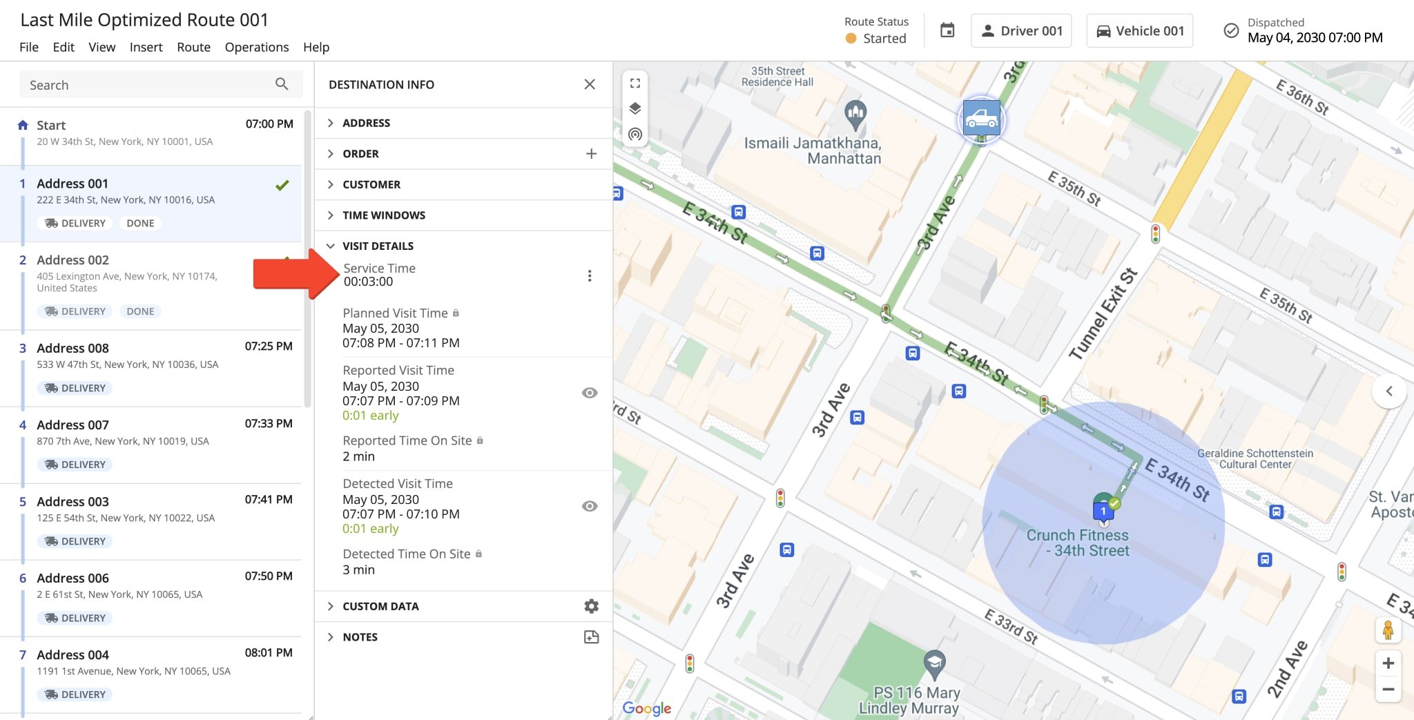
Planned “Service Time” can be assigned to individual destinations and is used when optimizing routes and calculating route duration. NOTE: Learn more about service time.
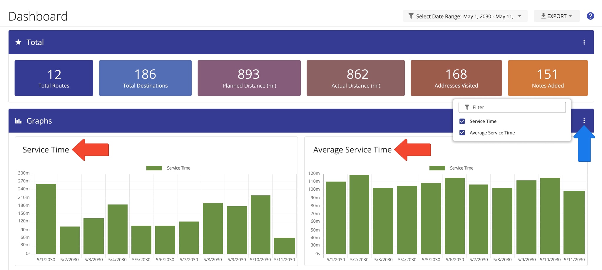
The “Service Time” graph shows the total planned service time for routes scheduled within your selected date range and team members.
You can set service time when uploading routing spreadsheets, through Optimization Profiles, or in your manual optimization settings.
You can also view destination-level service time in the Route Editor, Routes Map, Route Manifest, and Route4Me Mobile Apps.
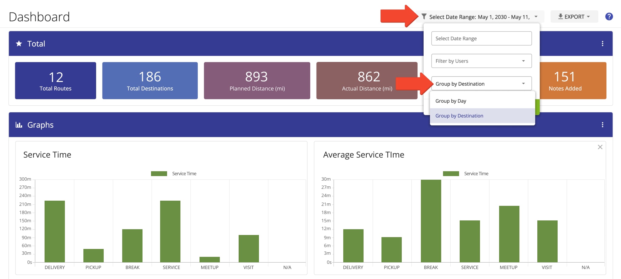
The “Average Service Time” graph shows the average planned service time for destinations on routes scheduled for your selected date and team members.
You can change how this data is grouped on the classic Charts Dashboard. Select “Group by Day” to view averages by date, or “Group by Destination” to compare planned Service Time across different destination types.
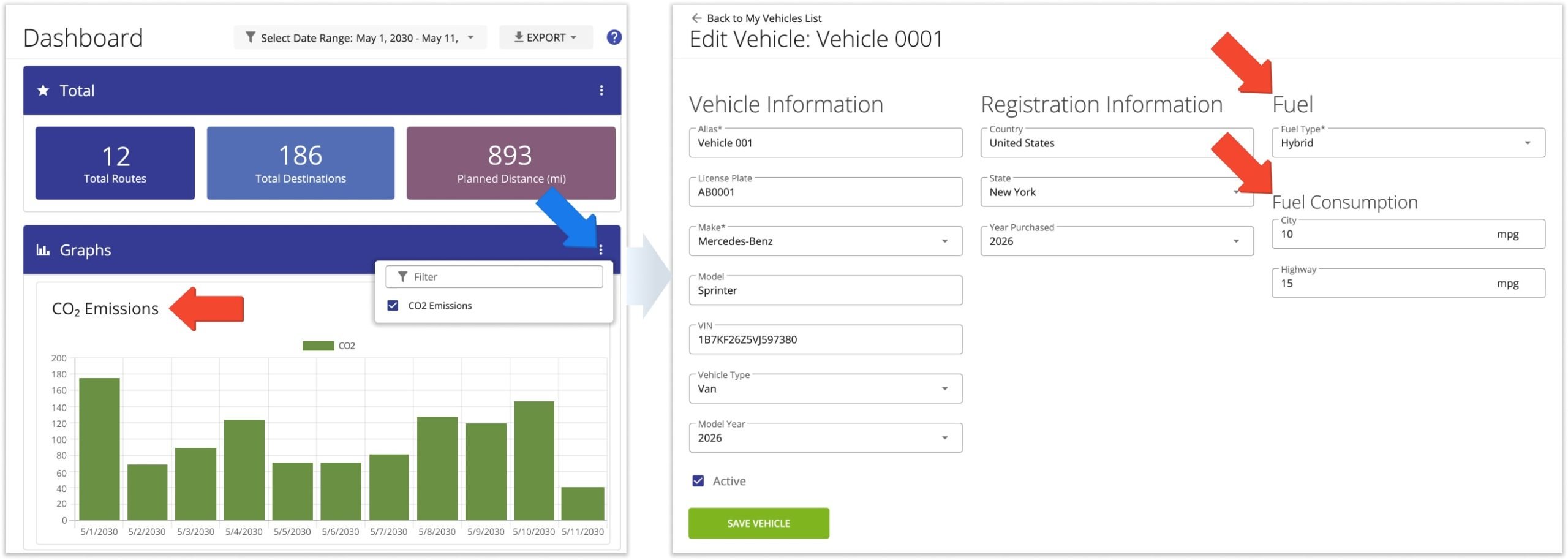
CO2 Emissions – Track Route Carbon Emissions In Charts Dashboard
The Charts Dashboard lets you track total CO2 emissions in metric tons for routes scheduled for your selected dates and team members. Emissions are calculated using each vehicle’s fuel type, fuel consumption, and route distance.
To view emissions, open the Three-dot Icon menu in the “Graphs” section and enable “CO2 Emissions“. NOTE: Learn more about vehicle settings and profiles.
Order Details – Order Cost, Cube Volume, Pieces, Revenue And Weight
Route4Me’s classic Charts Dashboard lets you view aggregated order data for routes scheduled within your selected dates and assigned to selected team members. Track total cost, cube volume, pieces, revenue, and weight for delivered or picked-up orders.
In the “Graphs” section, open the Three-dot Icon menu and enable the order metrics you want to view. You can also add order details to destinations when planning routes with spreadsheets.
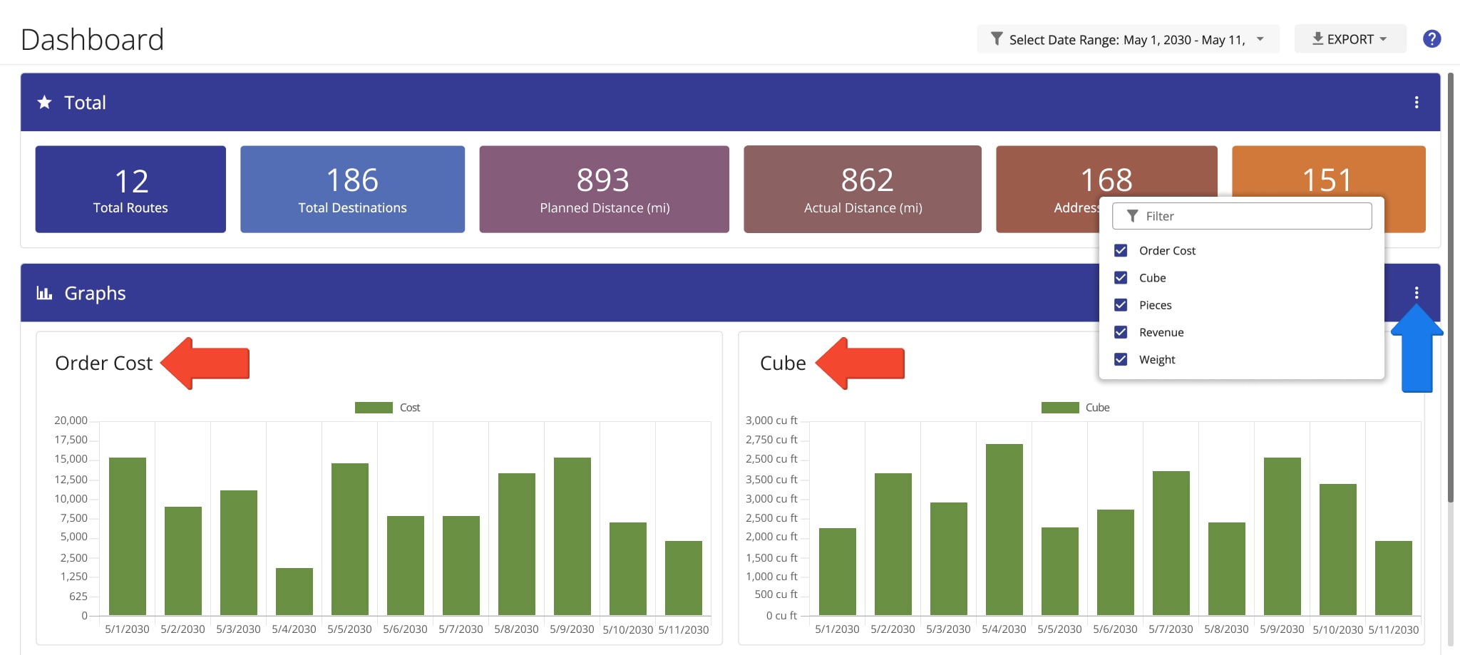
Classic Charts Dashboard – Order Details
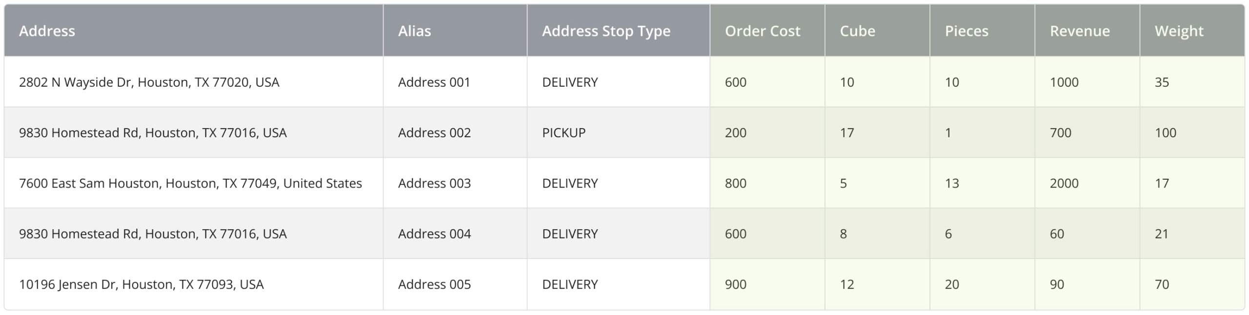
You can add order details to destinations when planning routes with spreadsheets.
Add the relevant order information as additional columns in your routing spreadsheet, with each column corresponding to an address. NOTE: Learn more about Route4Me’s spreadsheet formatting requirements.
Notes – Track Route Destination Notes In Charts Dashboard
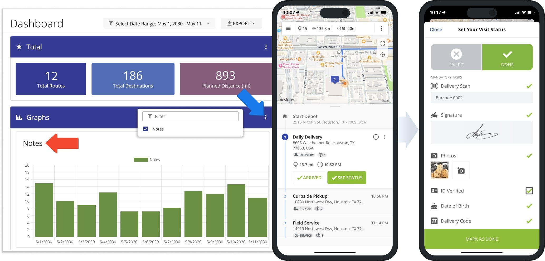
Field employees can add notes to destinations while completing routes, including customer signatures, images, and other proof of delivery (POD), proof of visit, or proof of service configured through Workflows.
The classic Charts Dashboard lets you track the number of notes added to destinations for your selected dates and team members. Enable “Notes” in the “Total” section for an overall count, or in the “Graphs” section to view Notes grouped by date or destination type.
Drivers can add destination notes through the Route4Me Android and iOS apps. But keep in mind that a visited destination may not have a note if no POD or other supporting information was added.
Visit Route4Me's Marketplace to Check out Associated Modules:
- Operations
Audit Logging and Activity Stream
- Operations
Custom Data Add-On
- Operations
Advanced Team Management Add-On
About author: Kristian Andreev