
Service Time Heatmaps – Location And Destination Service Time Analysis And Distribution
Route4Me Service Time Heatmaps provide a visual representation of how Service Time for Locations and route destinations is distributed over a specific period. Instead of reviewing individual values, you can use heatmaps to identify patterns, allocation, inconsistencies, and trends in service duration. Keep reading to learn about Service Time analysis with heatmaps.

Table of Contents
Service Time Analysis – Service Duration Heatmaps Overview
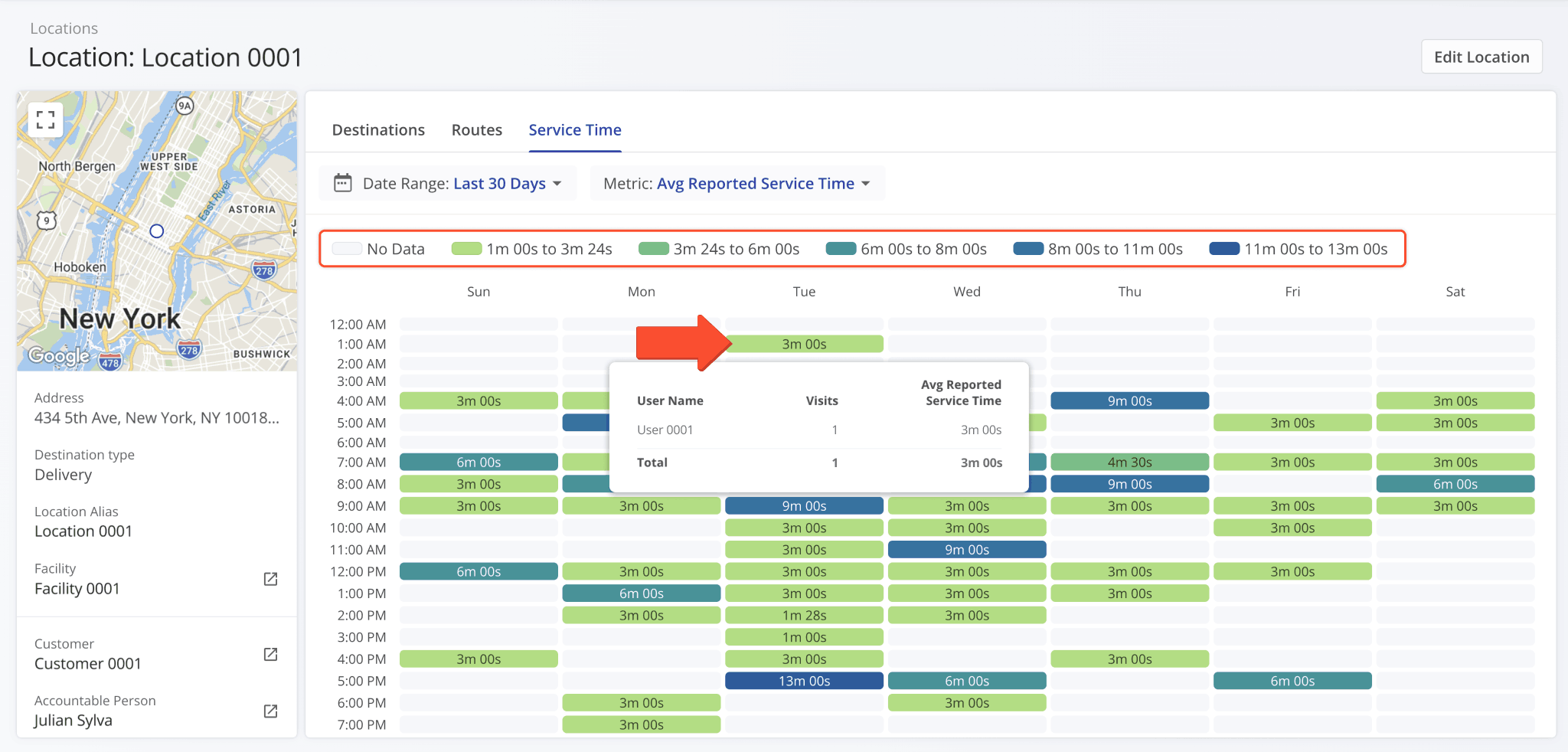
Service Time Heatmaps are visual dashboards that show how service duration is distributed across a specific period. Each block represents a single Service Time event or visit, and blocks are shaded depending on their relative duration.
Specifically, shorter visits are lighter and longer visits are darker. You can also hover over individual blocks to get additional information. Keep reading to learn how to open and customize Service Time analysis heatmaps.
Service Time Heatmaps For Route Destinations
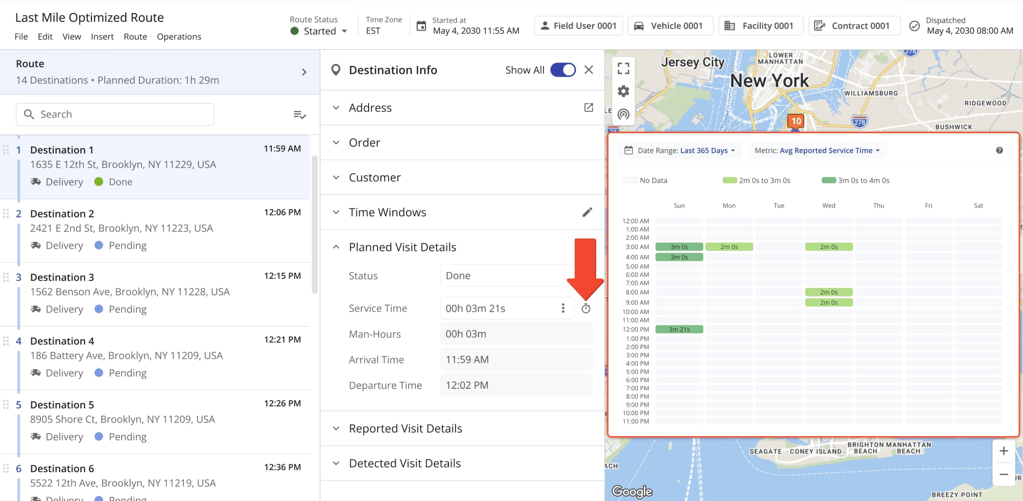
You can find Service Time Heatmaps where detailed Location and destination data is available. For example, you can use the Route Editor for destination Service Time analysis in the context of a planned route.
Open a route in the Route Editor and click a destination to open its Destination Info. Then, go to the “Planned Visit Details” section and click the Time Icon to see that destination’s Service Time Heatmap.
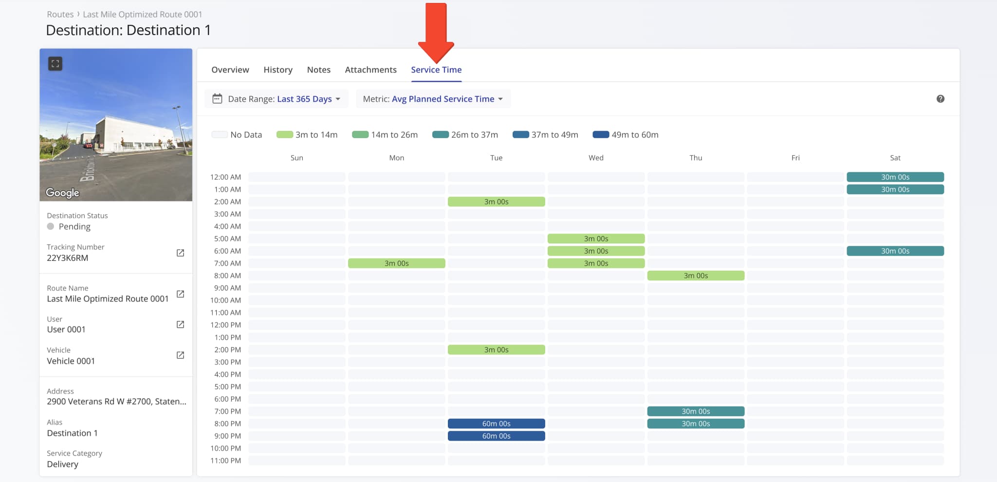
Individual destination Service Time is also available in Destination Snapshots. Simply go to the “Service Time” category to see an expanded view of a destination’s Service Time Heatmap.
Customer Location Service Time Heatmaps
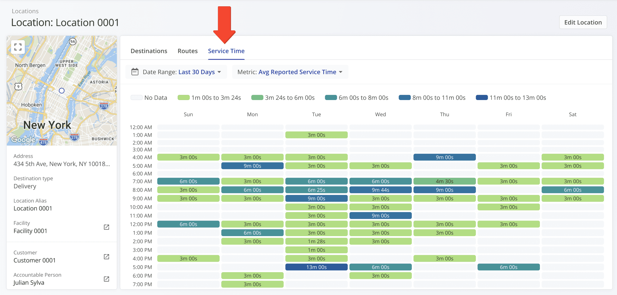
In addition to route destinations, Service Time Heatmaps are also available for Locations. To see the distribution of Service Time at a specific Location, first open its Location Snapshot. Then, simply go to the “Service Time” tab.
Service Time Heatmap Settings And Filters
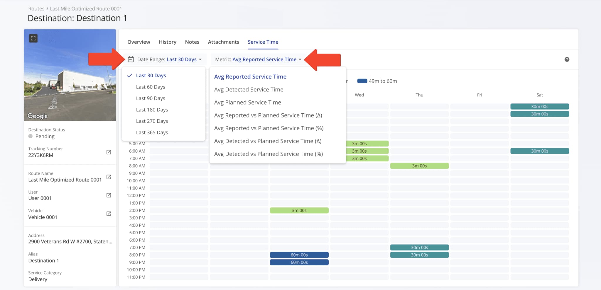
You can use the “Date Range” and “Metric” fields to customize your Service Time Heatmaps.
- Date Range: Select the period of time for which Service Time events will be shown.
- Metric: Select the specific type of Service Time event or entry to show on the heatmap.
See the table below for more information on Service Time metrics available in heatmaps.
| Column | Description |
|---|---|
| Avg Reported Service Time | Average service time reported manually by users at the destination. Reflects what actually happened according to human input, rather than system estimates. |
| Avg Detected Service Time | Average service time automatically detected via geofence triggers. A system-generated value that captures when a vehicle enters and leaves a location. |
| Avg Planned Service Time | Planned service time estimated for the destination. Expected duration set during route planning. |
| Avg Reported vs Planned Service Time (Δ) | Difference between reported and planned service times. Shows whether stops generally took longer or shorter than expected. |
| Avg Reported vs Planned Service Time (%) | Percentage difference between reported and planned service times. Easily see deviations relative to the route plan. |
| Avg Detected vs Planned Service Time (Δ) | Difference between geofence-detected and planned service times. Highlights where automated tracking differs from the schedule. |
| Avg Detected vs Planned Service Time (%) | Percentage difference between detected and planned service times. Compares automated measurements against planned expectations. |
Visit Route4Me's Marketplace to Check out Associated Modules:
About author: Kristian Andreev