
Operations Dashboard – Real-Time Company Performance & Health Overview
The Operations Dashboard gives you a real-time overview of your organization’s last mile performance and operations health. Track User and Vehicle locations on the Live Map, monitor Route and Destination completion metrics, and stay on top of Route, Destination, and operational events with a prioritized Activity Feed – all from a single, configurable interface. In this guide, you’ll learn how to set up the Dashboard, track resources on the Live Map, and monitor operational events in real time.
NOTE: Operations Dashboard Resources currently include Destinations, Routes, Users, Vehicles, Facilities, and Regions.
Table of Contents
Operations Dashboard Overview – Interface Structure And View Modes
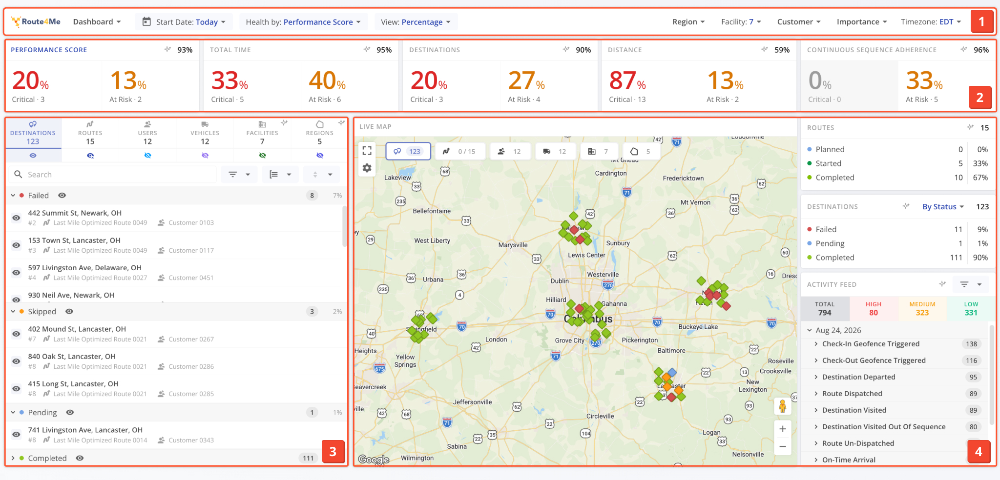
The Dashboard is organized into four core tools that work together to provide full visibility into your last mile operations:
- Header: Top bar where you can configure dashboard settings.
- Health Trackers: Aggregate health scores for different factors. See Dashboard Settings to learn more.
- Resource List: Side bar where you can toggle resource visibility for the Live Map.
- Panels: Additional tools like the Live Map, Route and Destination status trackers, Activity Feed, etc.
Open Your Operations Dashboard
The Operations Dashboard has two main view modes:
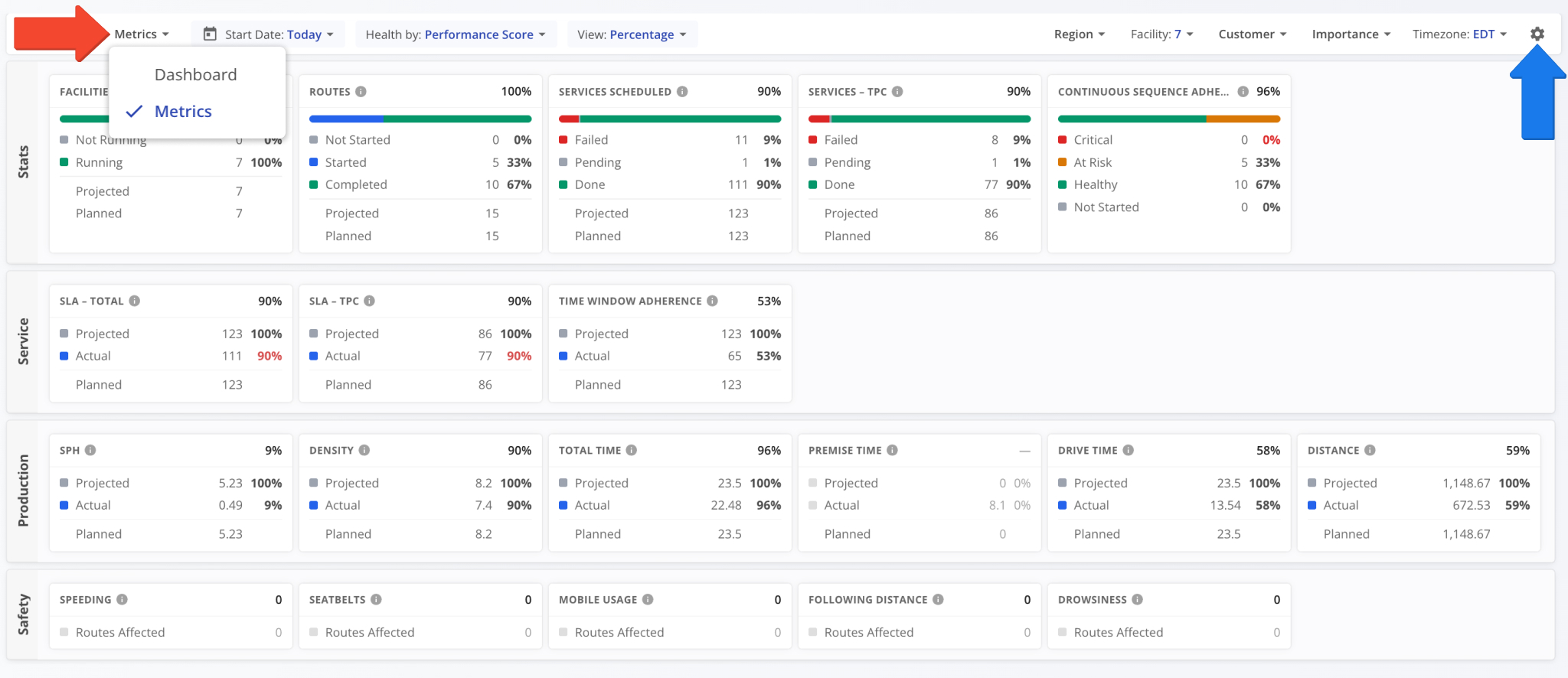
- Dashboard: Default mode for visualizing in-depth operations health for resources like Destinations, Routes, Users, Vehicles, etc.
- Metrics: Data-first operations health metrics focused on easily accessing and comparing health metrics across different factors.
You can use the menu in the top-left to select a view mode. Each mode can be further customized by clicking the Gear Icon.
Dashboard Settings – Configure Panels, Filters And Company Resources
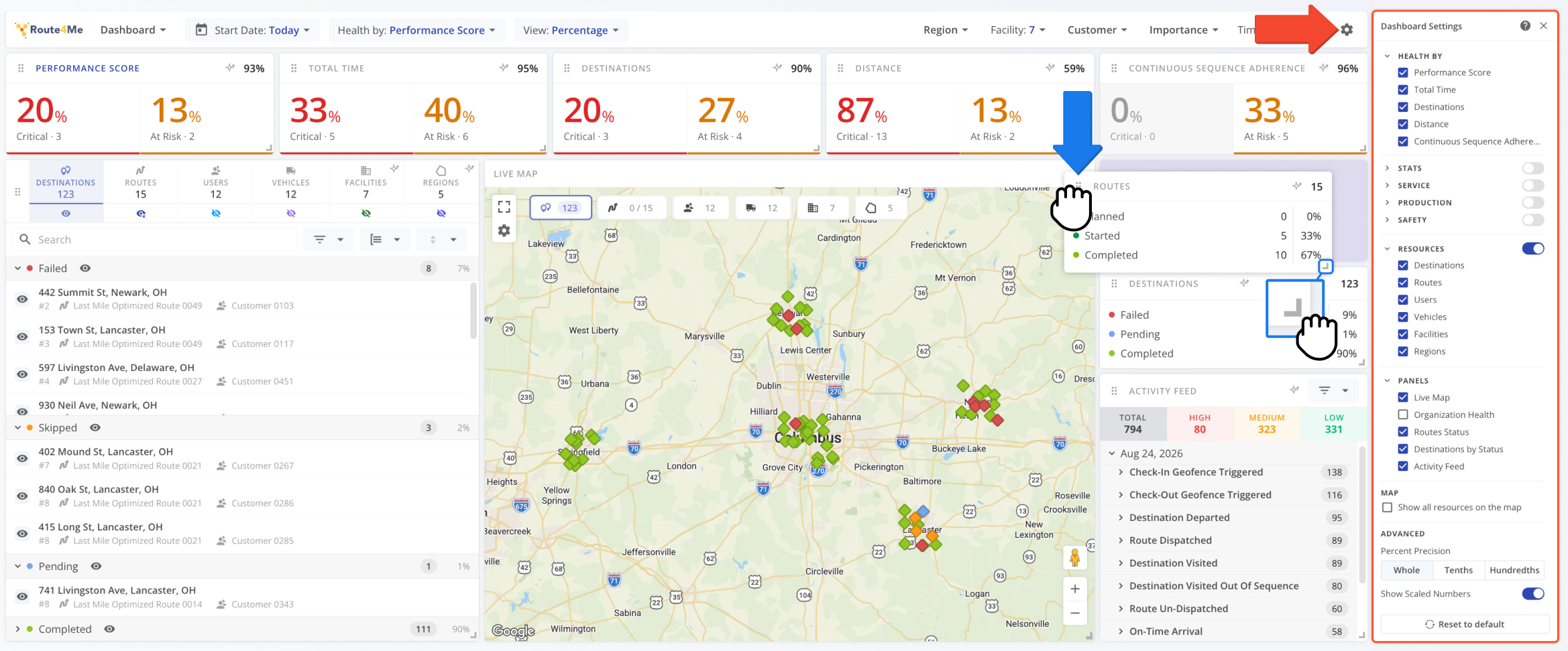
You can customize the Dashboard to suit your needs by clicking the Gear Icon in the top-right to open the “Dashboard Settings“.
From there, you can toggle different parts of the Operations Dashboard interface. With the settings open, you can also reposition and resize enabled panels according to your preferences. Changes are saved automatically.
See the tables below for a full list of settings available in the Dashboard and Metrics view modes. If you have any further questions after reading this guide, please contact Route4Me Support.
Dashboard Settings - Dashboard Mode
Dashboard Settings - Metrics Mode
Health Metrics And Filters – Set Your Date Range, Timezone And Scope
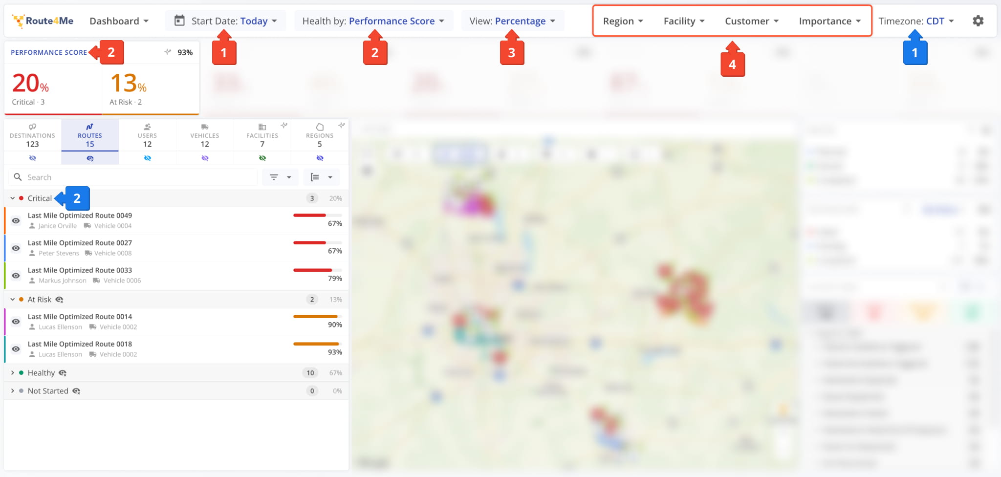
After setting up your Operations Dashboard layout, you can configure the:
- Date Range: Select a Route scheduled start date range to filter resources by.
You can use the Timezone field on the right to select which timezone will be used on the dashboard to report events, updates, etc. - Health Metrics: Select which metric will be used to measure operations health:
- Performance Score: Weighted blend of Destinations, Time and Distance Adherence.
- Total Time: Planned vs. actual Route time.
- Destinations: Completed vs. pending Destinations on started Routes.
- Distance: Planned vs. actual Route distance.
- Continuous Sequence Adherence: Percentage of destinations visited consecutively in the planned Route sequence.
- View: Select whether Health Trackers will show percentages or total values.
- Global Filters: Filter Routes and resources by their associated Regions, Facilities, Customers, and Importance.
Regarding Health Metrics (2): The selected metric will be used to determine which health category a Route falls under in the Resource List. You can also select a Health Metric by clicking the title of the corresponding Health Tracker panel.
Resource List – Enable Routes, Users, Vehicles, And More On The Map
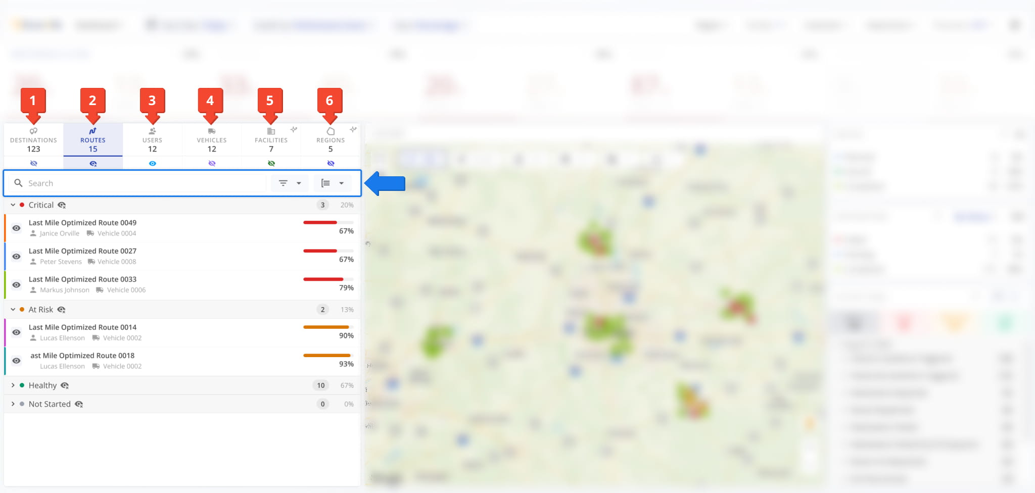
The Resource List in the Dashboard is divided into six main sections corresponding to the following resources:
- Destinations: Scheduled visits at customer addresses on Routes that match your filters.
- Routes: Planned and optimized last-mile Routes that match your filters.
- Users: Team members signed in to their Route4Me accounts that match your filters.
- Vehicles: Cars, vans, and other Company Vehicles that match your filters.
- Facilities: Depots, warehouses, and other Company Facilities assigned to Routes that match your filters.
- Regions: Operational Regions associated with Routes that match your filters.
Each section is divided into subsections broken down by the health metric or status. Additionally, each section has the same filter and grouping options as the main page for that resource, e.g. the “Routes” section supports the same options as the Routes Page.
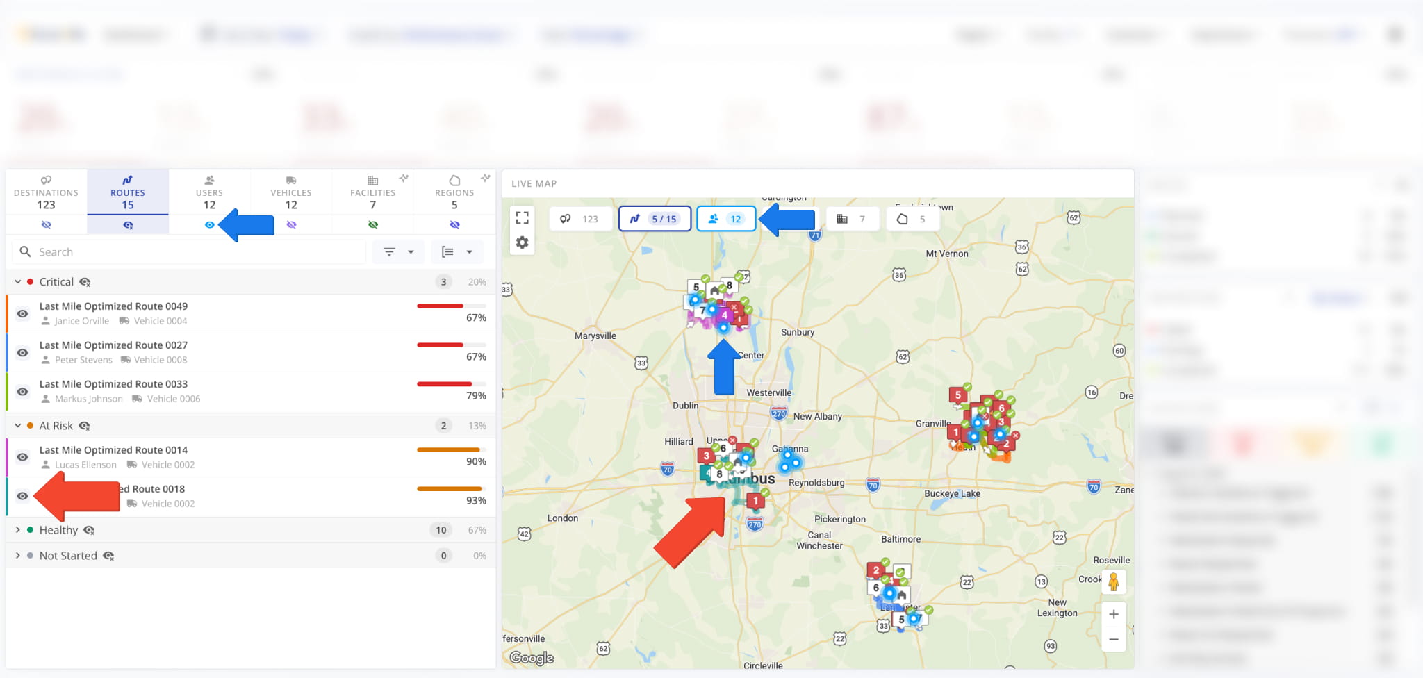
To see a specific resource on the map, you have to enable it. To do so, first open the relevant section of the Resource List and click the Eye Icon next to the resource. Additionally, to show all resources of that type on the map, you can:
- Click the Eye Icon under the Resource List section.
- Click the Resource Label in the “Live Map” panel of the Dashboard.
You can also use Map Layers to toggle resource visibility. Keep reading to learn about using the Live Map.
Live Map – Track Resource Locations And Configure Map Layers
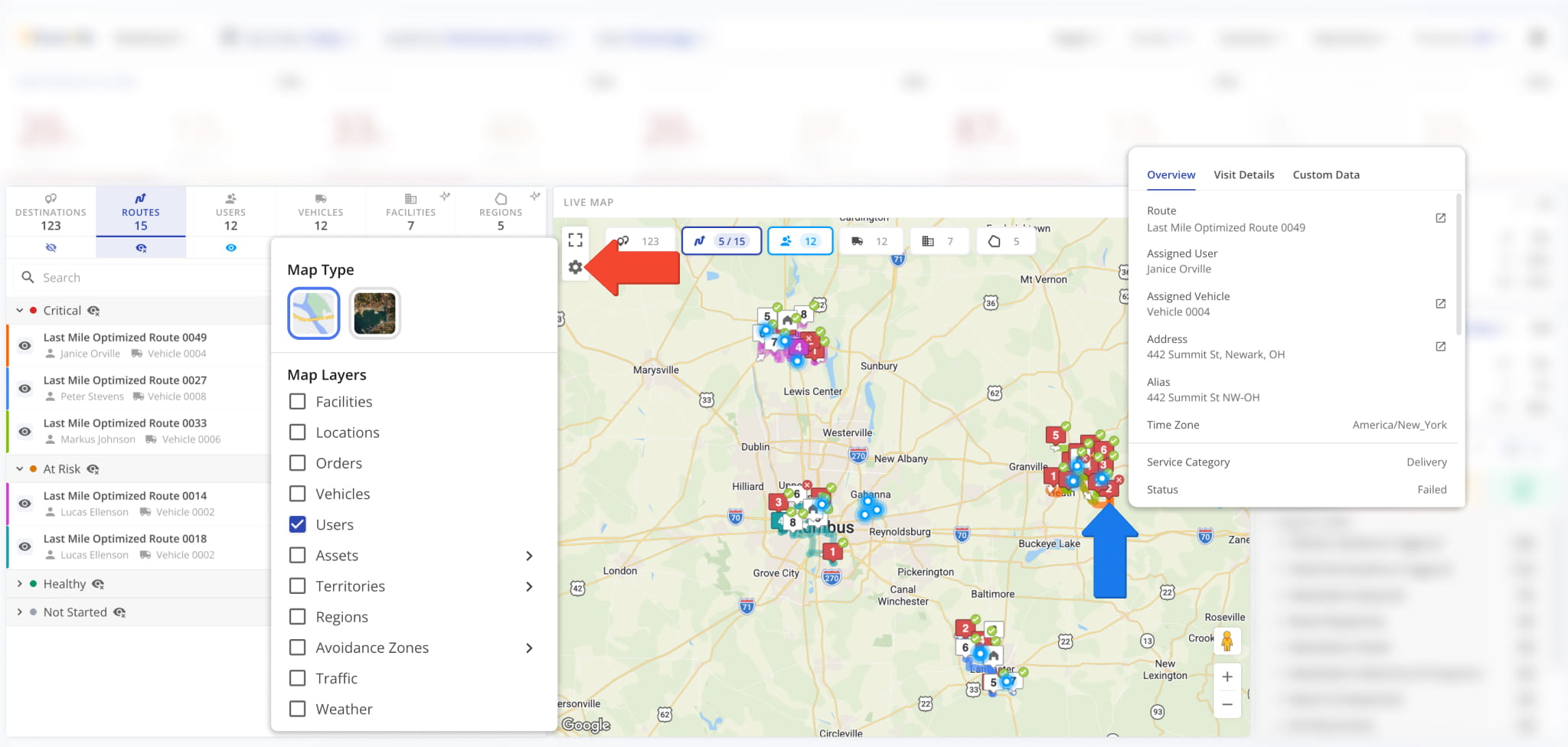
The Live Map shows the last synced location of the resources you selected, as described above. You can hover over any resource to see an overview of its associated details; e.g. hover over a destination to see its visit details, etc.
To enable map layers, simply click the Gear Icon and select your preferred options. Layers available in the Live Map are similar to those you can find in the main Routes Map on your account. See the table below to learn more.
Operations Dashboard Map Layers
Activity Feed Filters – Narrow Events By Type, User, And Route
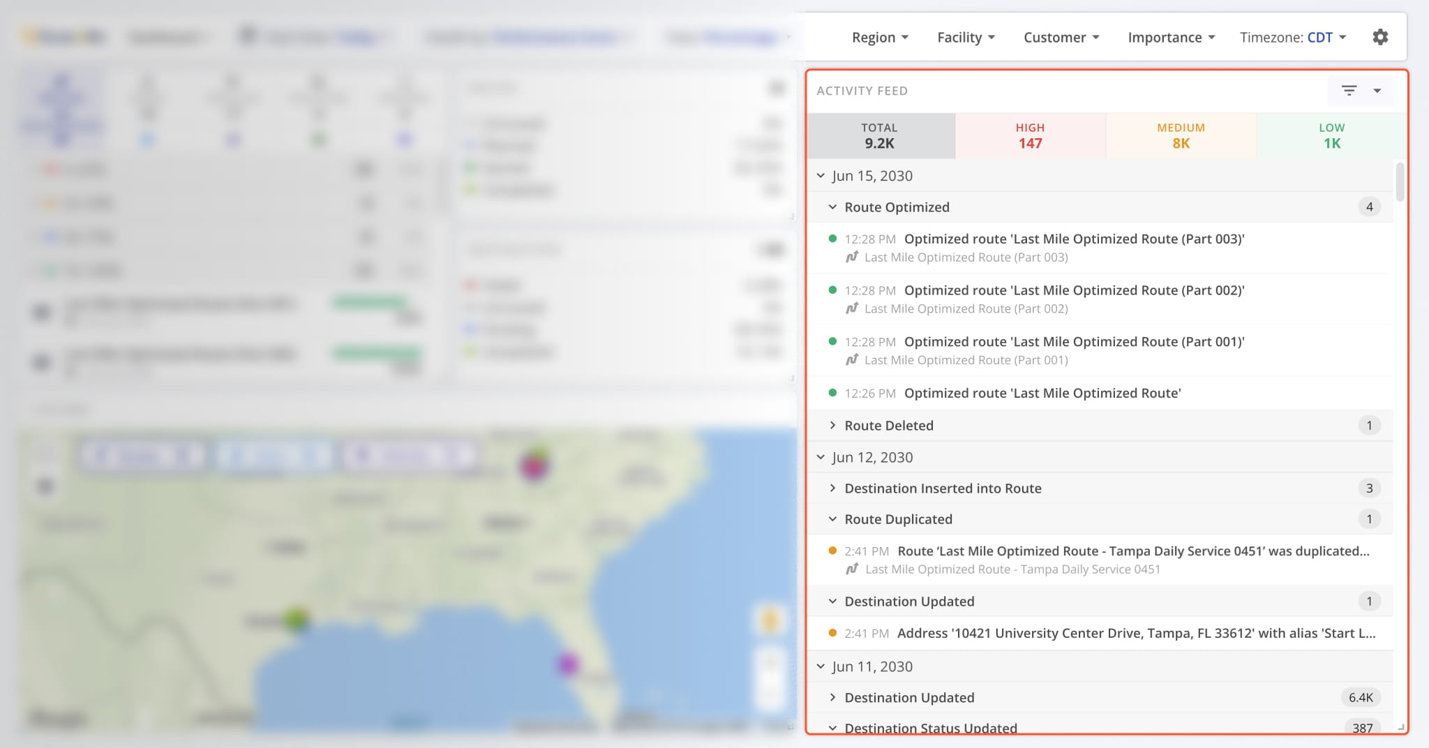
Data in the “Activity Feed” section of the Operations Dashboard is structured in the following three levels:
- Priority: Groups events by how much attention they might require.
- Date: Header that groups all event types that occurred on a specific date.
- Event Type: Header that groups all events of the same type with timestamps.
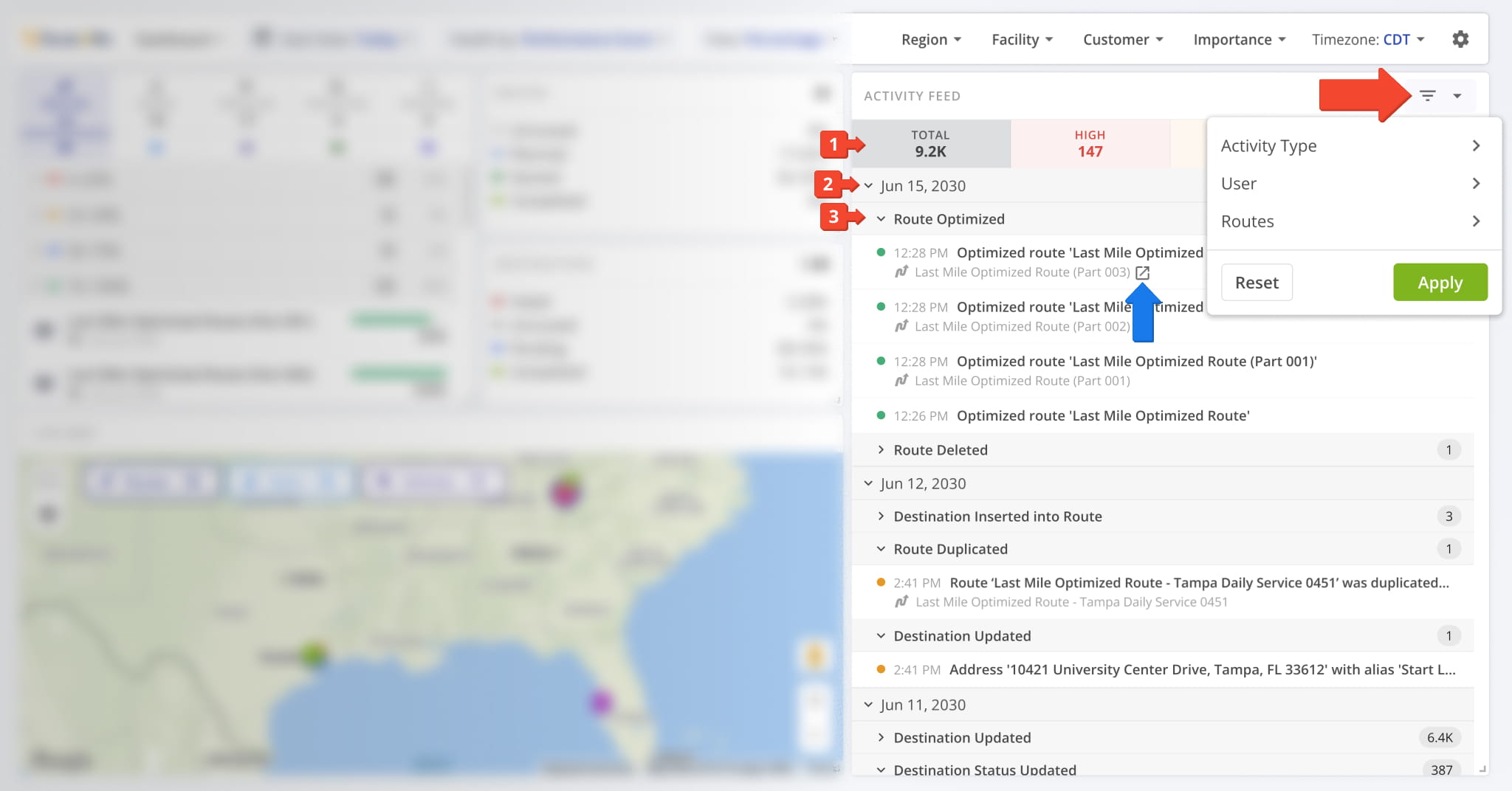
You can hover over entities like Routes and Users to see the Open Icon. Click it to go to the corresponding snapshot.
To more easily find the Activity Feed Events relevant to your needs, you can use the Filters Menu by clicking the button in the top-right. This enables you to filter the Activity Feed by event type, associated user, and Routes on which events occurred.
Activity Feed Priority – High, Medium And Low Event Tiers
The “Activity Feed” section of the Operations Dashboard shows activity updates divided into three priority tiers:
- High: Events that may require attention due to disrupting planned Routes.
- Medium: Changes made to Routes, destinations, and other non-disruptive manual actions.
- Low: Standard events triggered during normal operations, such as visiting destinations and completing Routes.
See the table below for a full list of Activity Feed events by priority. Learn more about the Route4Me Activity Feed.
Operations Dashboard Activity Feed Items
Operations Insights – Generate AI Analysis For Any Dashboard Item
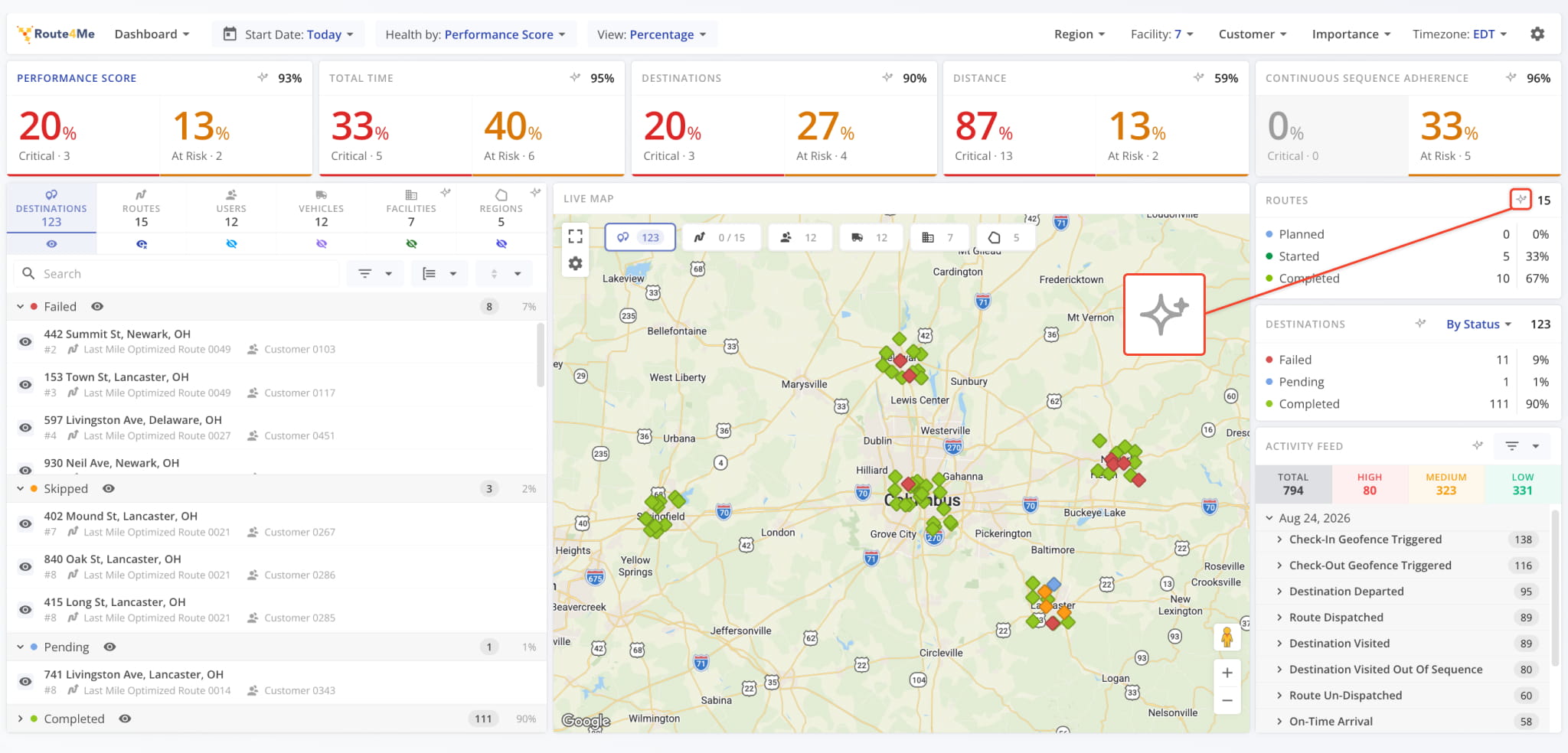
In the top-right corner of most panels on the Operations Dashboard, you’ll find the Operations Insight button. Click it to run an automatic AI analysis of the data for that specific panel.
The system evaluates multiple contributing factors for that metric and generates an Operations Insight report.
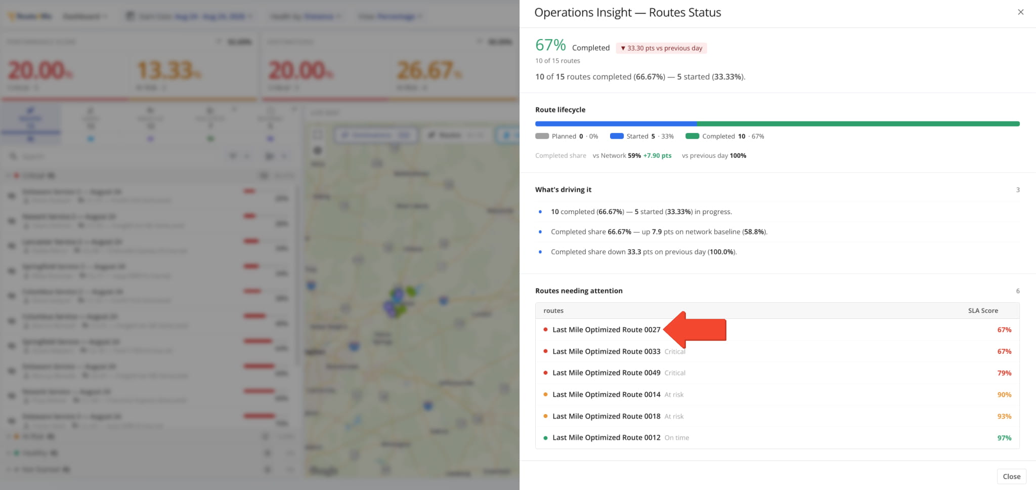
Each Operations Insight report starts with a summary of the health status or metric values for the selected resource, followed by a breakdown of specific items that require attention.
Every entry in the “needing attention” list is a dynamic link. Click any of them to open the corresponding resource. This lets you to move from a flagged metric straight to the record behind it without having to search manually.
Visit Route4Me's Marketplace to Check out Associated Modules:
- Operations
Audit Logging and Activity Stream
- Operations
Custom Data Add-On
- Operations
Advanced Team Management Add-On
About author: Kristian Andreev